Interactive Learning
One of the best ways to learn about coding is to just try it out! Below are some resources for you to try so you can practice creating data visualizations with R. To do this, we can use online tools to communicate while you change the code to anything you like! Don’t be afraid of breaking it because you can always reload the page.
Codeshare
Open this link and keep it for this portion of the talk so we can share some code with each other: codeshare.
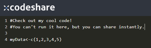
Figure 4: A. Santone
Choosing Colors
You can search “color chooser” in the Google Browser to find this tool, but you can also select from many other tools to find a hexadecimal code such as #FF0000, which encodes the color red.
Line Plot
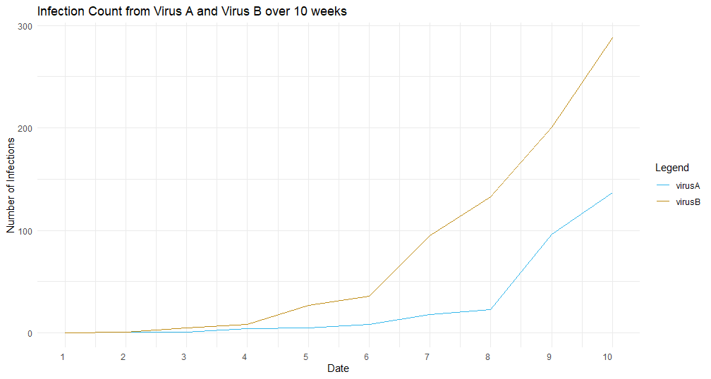
Figure 5: Credit: A. Santone
Line plots are typically used when showing some kind of (semi?)continuous data over a continuous range, such as height over time, for example. The line represents both known values and unknown, assumed values in between data points. One visual advantage of line plots is they are ‘light weight’ meaning they do not occupy too much room on the plot.
Let’s take a look at some R code for a line plot. This code uses the ‘tibble’ library for organizing the data in a well-formatted way, and ‘ggplot2’ to produce the graphics. The data are simulated (fake)! Your goal here is to change some variable names, data, color values, and other options to see what happens. Customize the plot so it looks good to you!
For additional help, check out this Quick Start Guide for Line Plots
What story can you tell from this plot?
What is the most important message the plot can tell you?
Bar Chart
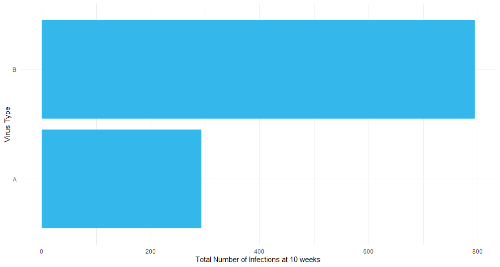
Figure 6: Credit: A. Santone
Bar charts are great for displaying and comparing quantities such as before/after values or perhaps Group A scores versus Group B scores.
Let’s take a look at some code to create a bar plot again based on the simulated (fake!) virus data over 10 weeks. Our goal this time is to compare the TOTAL number of infections from Virus A and Virus B. Because we are comparing two groups’ totals, a bar chart makes great sense.
Again, think about what changes you might make to this plot and try to either delete, modify, or add features to the plot based on some code you have seen.
For additional help, check out this Quick Start Guide for Bar Charts
Why is this chart type ideal for this information?
What is the main point of the story?
Scatter Plots
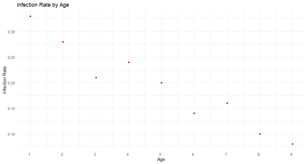
Figure 7: Credit: A. Santone
Scatter plots excel when you’re interested in examining the relationship of two variables such as age and resting heart rate, height and weight, or some other pair of potentially correlated data.
Why are scatter plots preferred for this information?
What relationship trend can you detect?
For additional help, check out this Quick Start Guide for Line Plots
Box Plots
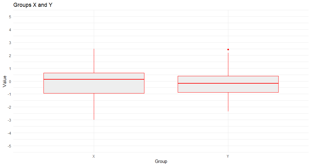
Figure 8: Credit: A. Santone
Box plots are used when you want to examine the distribution of data in one or more groups. Sometimes the average is just not enough information! So we can examine how the data are arranged around the mean. The “box” shows the quartiles of data above and below the mean while the “whiskers” show the other two quartiles. You can see if the data are tightly grouped near the mean or spread out very far.
Which group has a larger mean value?
Using the results of the t-test, are the groups significantly different?
For additional help, check out this Quick Start Guide for Line Plots
Build your own!
Word problem
Adam heard that more exercise is linked to lower resting heart rate. To investigate further, he located a research team (you!) that could provide a visualization of this relationship.
Guiding questions:
- What type of plot is ideal for this?
- What variables should be used?
- What ‘look’ would be good?
- How can we get started on this?
- What comments should be added to the code?
- What are effective labels?
- How do you ensure your message is clear? (what is your message?)
Goal: choose one of the above interactives and modify it to display the relationship of exercise and resting heart rate. You’ll have to provide the simulated data, but it’s okay because our goal is not accurate information on this visualization!