Analysis of COVID-19 Data
Scientific Questions
When thinking about the SARS-CoV-2 virus and the associated COVID-19 disease, many questions may come to mind. Among those, you may be wondering about the genetics of the virus: what similarities does its sequence share with other known viruses, how might the sequence influence tools that can be developed to combat its spread? You may wonder about the speed and spread of the disease: how rapidly does it spread in a population, how many total are infected, what is the recovery rate in infected individuals? Again, there are many ways to investigate but here we will do an analysis of the sequence and then investigate the timeline of infections.
Sequence Analysis
What would you like to measure regarding COVID-19?
GC Content
One way to examine a DNA sequence is to look at the GC-content proportion of G and C bases relative to the entire sequence. To do this, a scientist would count all of the bases and find the fraction that are G or C. It sounds tedious so a computer program is ideal for this type of task! Let’s use R to calculate the G+C ratio for a sequence of DNA. We can just use the SARS-CoV-2 sequence to test this program. To do the analysis, we can load the Biostrings package into R and use some of the built-in functionality. Tools like Biostrings were written for cases just like this! We can do the basic analysis in a few lines of code. A few more lines of code are required to gather and organize the data for specific gene-encoding regions in the sequence.
Data:
- FASTA LC522972.1 Severe acute respiratory syndrome coronavirus 2
First, we can load the sequence data from a FASTA file.
#load external packages
library(coRdon)
library(Biostrings)
library(tidyverse)
library(knitr)
library(kableExtra)
library(dplyr)

#===============
#load data
#===============
#read sequence data
#create any variable name you like
dnaSet <- readSet(file="data/sarscov2.fasta")

#extract the dnaString (single sequence) from the dnaStringSet (a list of sequences)
dna<-dnaSet[[1]]
Next, we can begin the analysis of GC content by obtaining the frequency of GC in the whole sequence and in specific regions that encode genes.
#===============
#GC Frequencies
#===============
#obtain the G+C frequency using 'letterFrequency'
gc_SEQ<-letterFrequency(dna, letters = "CG", as.prob = TRUE)

#gc for gene S
gene_s<-dna[21560:25381]
gc_s<-letterFrequency(gene_s, letters = "CG", as.prob = TRUE)

#ORF3a
gene_ORF3a<-dna[25390:26217]
gc_ORF3a<-letterFrequency(gene_ORF3a, letters = "CG", as.prob = TRUE)

#E
gene_E<-dna[26242:26469]
gc_E<-letterFrequency(gene_E, letters = "CG", as.prob = TRUE)

#M
gene_M<-dna[26520:27188]
gc_M<-letterFrequency(gene_M, letters = "CG", as.prob = TRUE)

#ORF6
gene_ORF6<-dna[27199:27384]
gc_ORF6<-letterFrequency(gene_ORF6, letters = "CG", as.prob = TRUE)

#ORF7a
gene_ORF7a<-dna[27391:27756]
gc_ORF7a<-letterFrequency(gene_ORF7a, letters = "CG", as.prob = TRUE)

#ORF8
gene_ORF8<-dna[27891:28256]
gc_ORF8<-letterFrequency(gene_ORF8, letters = "CG", as.prob = TRUE)

#N
gene_N<-dna[28271:29530]
gc_N<-letterFrequency(gene_N, letters = "CG", as.prob = TRUE)

#ORF10
gene_ORF10<-dna[29555:29671]
gc_ORF10<-letterFrequency(gene_ORF10, letters = "CG", as.prob = TRUE)
Next, we can organize the data to prepare it for visualization.
#===============
#organize data
#===============
#put the frequencies into a "tibble" to organize the data
tbl<-tibble(gc_SEQ,gc_s,gc_ORF3a,gc_E,gc_M,gc_ORF6,gc_ORF7a,gc_ORF8,gc_N,gc_ORF10, .name_repair = "unique")

#transpose the data (rows become columns)
tbl_t<- as.data.frame(t(as.matrix(tbl)))

#name the columns
tbl_t<- rownames_to_column(tbl_t, var = "CDS")
colnames(tbl_t)<-c("CDS", "GC_ratio")

#add a column containing the type of sequence (full or coding region)
tbl_t$seqType<-c("full","cds","cds","cds","cds","cds","cds","cds","cds","cds")

#sort the table by the ratio values
tbl_t<-tbl_t %>% arrange(GC_ratio)

#print a pretty table
kable(tbl_t)| CDS | GC_ratio | seqType |
|---|---|---|
| gc_ORF6 | 0.2795699 | cds |
| gc_ORF10 | 0.3418803 | cds |
| gc_ORF8 | 0.3579235 | cds |
| gc_s | 0.3731031 | cds |
| gc_SEQ | 0.3799451 | full |
| gc_E | 0.3815789 | cds |
| gc_ORF7a | 0.3825137 | cds |
| gc_ORF3a | 0.3949275 | cds |
| gc_M | 0.4260090 | cds |
| gc_N | 0.4714286 | cds |
Now, we can visualize the data to help us understand the GC-content of each portion of the sequence. This is a very basic plot and it needs some improvement!
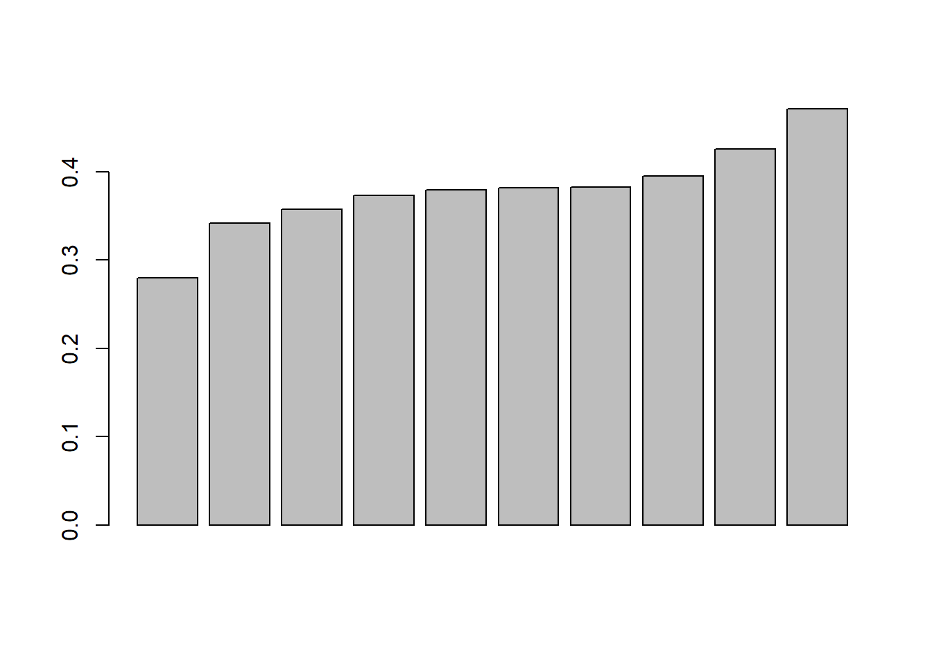
Let’s ask some questions:
- which gene/sequence has the highest GC ratio?
- what portion of the gene sequences have a gc ratio above 0.35?
What would you do to improve this plot?
Here is an upgraded plot that is more appealing. The ratio for the full sequence is highlighted for comparison to the coding regions. This plot uses a library called ‘ggplot2’ to handle the graphics. (Wickham 2009) You’ll notice the style of this code uses ‘+’ symbols to add features. You can think of it like:
- [main graph] +
- [draw some bars] +
- [make it sideways] +
- [add a title]+
- [change the colors] +
- [more cool stuff].
#ggplot2 graphics
ggplot(data=tbl_t, aes(x=CDS,y=GC_ratio,fill=factor(seqType))) +
  geom_bar(position="dodge",stat="identity") +
  coord_flip() +
  ggtitle("GC Ratio of CDS and full sequence in SARS-CoV-2") +
  ylab("GC Ratio")+
  scale_fill_manual(values=c("#f0f0f0", "#ff0000"),labels=c("CDS","Full Sequence"))+
  theme_minimal() +
  scale_x_discrete(
    limits=c(tbl_t$CDS),
    labels=c(tbl_t$CDS)
    )  +
  theme(
    legend.title=element_blank(),
    legend.position=c(.1,.9),
    axis.title.y=element_blank(),
    text=element_text(size=12),
    plot.title=element_text(face="bold",hjust=c(0,0))
    )+
  theme(legend.position="bottom", legend.box = "horizontal")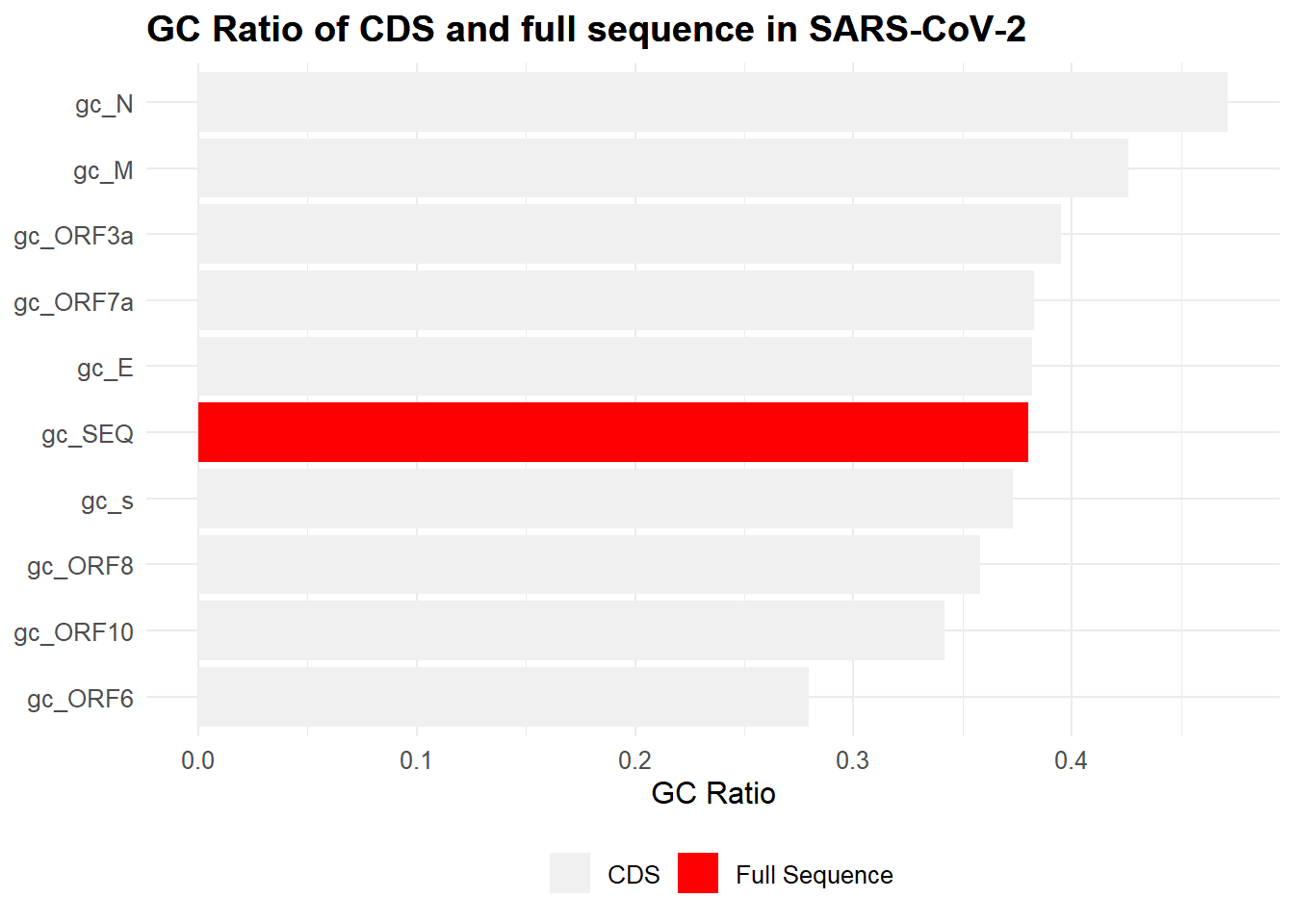
Let’s AGAIN ask some questions:
- Which gene/sequence has the highest GC ratio?
- What portion of the gene sequences have a gc ratio above 0.35?
What are some strengths and weaknesses of this plot?
If you’re interested, the ‘gc_N’ gene (not official name) is described here and here. It is a nucleocapsid phosphoprotein that helps to package the viral genome, among other functions. The original information regarding the coding regions (used to create these visualizations) of the SARS-CoV-2 virus was found here.
Timeline Analysis
Loading Data
Our first step is to load in the most current data. These data were obtained from a GitHub repository maintained by Johns Hopkins University. If you want a copy of the data for yourself, visit that site and click ‘Clone or download’ and then ‘Download ZIP’ to save the information. The data used in this analysis are from the ‘csse_covid_19_time_series’ folder.
#read data from a .csv file
confirmed<-read_csv("data/march2020/time_series_19-covid-Confirmed.csv")

#preview the first few rows of data
head(confirmed)
## # A tibble: 6 x 60
## `Province/State` `Country/Region` Lat Long `1/22/20` `1/23/20` `1/24/20` `1/25/20` `1/26/20` `1/27/20` `1/28/20` `1/29/20`
## <chr> <chr> <dbl> <dbl> <dbl> <dbl> <dbl> <dbl> <dbl> <dbl> <dbl> <dbl>
## 1 <NA> Thailand 15 101 2 3 5 7 8 8 14 14
## 2 <NA> Japan 36 138 2 1 2 2 4 4 7 7
## 3 <NA> Singapore 1.28 104. 0 1 3 3 4 5 7 7
## 4 <NA> Nepal 28.2 84.2 0 0 0 1 1 1 1 1
## 5 <NA> Malaysia 2.5 112. 0 0 0 3 4 4 4 7
## 6 British Columbia Canada 49.3 -123. 0 0 0 0 0 0 1 1
## # ... with 48 more variables: `1/30/20` <dbl>, `1/31/20` <dbl>, `2/1/20` <dbl>, `2/2/20` <dbl>, `2/3/20` <dbl>, `2/4/20` <dbl>,
## # `2/5/20` <dbl>, `2/6/20` <dbl>, `2/7/20` <dbl>, `2/8/20` <dbl>, `2/9/20` <dbl>, `2/10/20` <dbl>, `2/11/20` <dbl>,
## # `2/12/20` <dbl>, `2/13/20` <dbl>, `2/14/20` <dbl>, `2/15/20` <dbl>, `2/16/20` <dbl>, `2/17/20` <dbl>, `2/18/20` <dbl>,
## # `2/19/20` <dbl>, `2/20/20` <dbl>, `2/21/20` <dbl>, `2/22/20` <dbl>, `2/23/20` <dbl>, `2/24/20` <dbl>, `2/25/20` <dbl>,
## # `2/26/20` <dbl>, `2/27/20` <dbl>, `2/28/20` <dbl>, `2/29/20` <dbl>, `3/1/20` <dbl>, `3/2/20` <dbl>, `3/3/20` <dbl>,
## # `3/4/20` <dbl>, `3/5/20` <dbl>, `3/6/20` <dbl>, `3/7/20` <dbl>, `3/8/20` <dbl>, `3/9/20` <dbl>, `3/10/20` <dbl>,
## # `3/11/20` <dbl>, `3/12/20` <dbl>, `3/13/20` <dbl>, `3/14/20` <dbl>, `3/15/20` <dbl>, `3/16/20` <dbl>, `3/17/20` <dbl>Filtering Data
We’re interested in examining the rise (and fall?) of infections in China, Italy, South Korea, and the United States from the first date through the most current date. Ideally, we will produce a line graph with a single line for each country. Problem: our dataset has more information than we need and we should filter it to a smaller set of information so 1) it’s easier for a human to see what’s happening and 2) it’s easier for the computer to process. Now, this is not a huge dataset, but it’s good practice to understand how to limit the scope of your data for analyses. This portion of data analysis is sometimes called ‘data wrangling’ because we need to ‘wrangle’ the data into good form before we work with it directly. It’s a great idea to separate your main data from the data you wrangled so you can always go back to the main file.
#rename a column
#use 'dplyr::' to force the function from dplyr to be used
confirmed<-dplyr::rename(confirmed, region = "Country/Region")
#preview the first few rows of data
head(confirmed)
## # A tibble: 6 x 60
## `Province/State` region Lat Long `1/22/20` `1/23/20` `1/24/20` `1/25/20` `1/26/20` `1/27/20` `1/28/20` `1/29/20` `1/30/20`
## <chr> <chr> <dbl> <dbl> <dbl> <dbl> <dbl> <dbl> <dbl> <dbl> <dbl> <dbl> <dbl>
## 1 <NA> Thail~ 15 101 2 3 5 7 8 8 14 14 14
## 2 <NA> Japan 36 138 2 1 2 2 4 4 7 7 11
## 3 <NA> Singa~ 1.28 104. 0 1 3 3 4 5 7 7 10
## 4 <NA> Nepal 28.2 84.2 0 0 0 1 1 1 1 1 1
## 5 <NA> Malay~ 2.5 112. 0 0 0 3 4 4 4 7 8
## 6 British Columbia Canada 49.3 -123. 0 0 0 0 0 0 1 1 1
## # ... with 47 more variables: `1/31/20` <dbl>, `2/1/20` <dbl>, `2/2/20` <dbl>, `2/3/20` <dbl>, `2/4/20` <dbl>, `2/5/20` <dbl>,
## # `2/6/20` <dbl>, `2/7/20` <dbl>, `2/8/20` <dbl>, `2/9/20` <dbl>, `2/10/20` <dbl>, `2/11/20` <dbl>, `2/12/20` <dbl>,
## # `2/13/20` <dbl>, `2/14/20` <dbl>, `2/15/20` <dbl>, `2/16/20` <dbl>, `2/17/20` <dbl>, `2/18/20` <dbl>, `2/19/20` <dbl>,
## # `2/20/20` <dbl>, `2/21/20` <dbl>, `2/22/20` <dbl>, `2/23/20` <dbl>, `2/24/20` <dbl>, `2/25/20` <dbl>, `2/26/20` <dbl>,
## # `2/27/20` <dbl>, `2/28/20` <dbl>, `2/29/20` <dbl>, `3/1/20` <dbl>, `3/2/20` <dbl>, `3/3/20` <dbl>, `3/4/20` <dbl>,
## # `3/5/20` <dbl>, `3/6/20` <dbl>, `3/7/20` <dbl>, `3/8/20` <dbl>, `3/9/20` <dbl>, `3/10/20` <dbl>, `3/11/20` <dbl>,
## # `3/12/20` <dbl>, `3/13/20` <dbl>, `3/14/20` <dbl>, `3/15/20` <dbl>, `3/16/20` <dbl>, `3/17/20` <dbl>#rename 'Korea, South' to a simpler form
#use 'gsub' for a simple substitution
confirmed$region<-gsub("Korea, South", "Korea", confirmed$region)
#drop some columns by name and filter to only the desired regions
#from the data: Korea, South; US; China; Italy)
#create new data object called 'filtered' to represent the data we will analyze
filtered<-select(filter(confirmed, region %in% c("China", "Italy", "Korea" , "US")), -c('Province/State', 'Lat', 'Long'))
#preview the first few rows of data
head(filtered)## # A tibble: 6 x 57
## region `1/22/20` `1/23/20` `1/24/20` `1/25/20` `1/26/20` `1/27/20` `1/28/20` `1/29/20` `1/30/20` `1/31/20` `2/1/20` `2/2/20`
## <chr> <dbl> <dbl> <dbl> <dbl> <dbl> <dbl> <dbl> <dbl> <dbl> <dbl> <dbl> <dbl>
## 1 Italy 0 0 0 0 0 0 0 0 0 2 2 2
## 2 US 0 0 0 0 0 0 0 0 0 0 0 0
## 3 US 0 0 0 0 0 0 0 0 0 0 0 0
## 4 US 0 0 0 0 0 0 0 0 0 0 0 0
## 5 US 0 0 0 0 0 0 0 0 0 0 0 0
## 6 US 0 0 0 0 0 0 0 0 0 0 0 0
## # ... with 44 more variables: `2/3/20` <dbl>, `2/4/20` <dbl>, `2/5/20` <dbl>, `2/6/20` <dbl>, `2/7/20` <dbl>, `2/8/20` <dbl>,
## # `2/9/20` <dbl>, `2/10/20` <dbl>, `2/11/20` <dbl>, `2/12/20` <dbl>, `2/13/20` <dbl>, `2/14/20` <dbl>, `2/15/20` <dbl>,
## # `2/16/20` <dbl>, `2/17/20` <dbl>, `2/18/20` <dbl>, `2/19/20` <dbl>, `2/20/20` <dbl>, `2/21/20` <dbl>, `2/22/20` <dbl>,
## # `2/23/20` <dbl>, `2/24/20` <dbl>, `2/25/20` <dbl>, `2/26/20` <dbl>, `2/27/20` <dbl>, `2/28/20` <dbl>, `2/29/20` <dbl>,
## # `3/1/20` <dbl>, `3/2/20` <dbl>, `3/3/20` <dbl>, `3/4/20` <dbl>, `3/5/20` <dbl>, `3/6/20` <dbl>, `3/7/20` <dbl>, `3/8/20` <dbl>,
## # `3/9/20` <dbl>, `3/10/20` <dbl>, `3/11/20` <dbl>, `3/12/20` <dbl>, `3/13/20` <dbl>, `3/14/20` <dbl>, `3/15/20` <dbl>,
## # `3/16/20` <dbl>, `3/17/20` <dbl>Data Anatomy
Our data set at this point has a ‘character’ column with text values and a bunch of ‘double’ columns containing numeric values which represent the confirmed cases of COVID-19. You may notice the header row contains ‘region’ and a bunch of dates in the format Month/Day/Year. These appear as text labels and we can use them as information for our plots.
## # A tibble: 6 x 57
##   region `1/22/20` `1/23/20` `1/24/20` `1/25/20` `1/26/20` `1/27/20` `1/28/20` `1/29/20` `1/30/20` `1/31/20` `2/1/20` `2/2/20`
##   <chr>      <dbl>     <dbl>     <dbl>     <dbl>     <dbl>     <dbl>     <dbl>     <dbl>     <dbl>     <dbl>    <dbl>    <dbl>
## 1 Italy          0         0         0         0         0         0         0         0         0         2        2        2
## 2 US             0         0         0         0         0         0         0         0         0         0        0        0
## 3 US             0         0         0         0         0         0         0         0         0         0        0        0
## 4 US             0         0         0         0         0         0         0         0         0         0        0        0
## 5 US             0         0         0         0         0         0         0         0         0         0        0        0
## 6 US             0         0         0         0         0         0         0         0         0         0        0        0
## # ... with 44 more variables: `2/3/20` <dbl>, `2/4/20` <dbl>, `2/5/20` <dbl>, `2/6/20` <dbl>, `2/7/20` <dbl>, `2/8/20` <dbl>,
## #   `2/9/20` <dbl>, `2/10/20` <dbl>, `2/11/20` <dbl>, `2/12/20` <dbl>, `2/13/20` <dbl>, `2/14/20` <dbl>, `2/15/20` <dbl>,
## #   `2/16/20` <dbl>, `2/17/20` <dbl>, `2/18/20` <dbl>, `2/19/20` <dbl>, `2/20/20` <dbl>, `2/21/20` <dbl>, `2/22/20` <dbl>,
## #   `2/23/20` <dbl>, `2/24/20` <dbl>, `2/25/20` <dbl>, `2/26/20` <dbl>, `2/27/20` <dbl>, `2/28/20` <dbl>, `2/29/20` <dbl>,
## #   `3/1/20` <dbl>, `3/2/20` <dbl>, `3/3/20` <dbl>, `3/4/20` <dbl>, `3/5/20` <dbl>, `3/6/20` <dbl>, `3/7/20` <dbl>, `3/8/20` <dbl>,
## #   `3/9/20` <dbl>, `3/10/20` <dbl>, `3/11/20` <dbl>, `3/12/20` <dbl>, `3/13/20` <dbl>, `3/14/20` <dbl>, `3/15/20` <dbl>,
## # `3/16/20` <dbl>, `3/17/20` <dbl>Aggregating Data
We have multiple values for each region due to the different sub-regions that were not retained in the data set. We’ll want to collapse these rows by each region. For example, there are several ‘US’ rows, each with their own timeline but we would like to simplify this to a single ‘US’ row. In the end, we should have a single row for each of the four regions of interest.
## # A tibble: 4 x 57
##   region `1/22/20` `1/23/20` `1/24/20` `1/25/20` `1/26/20` `1/27/20` `1/28/20` `1/29/20` `1/30/20` `1/31/20` `2/1/20` `2/2/20`
##   <chr>      <dbl>     <dbl>     <dbl>     <dbl>     <dbl>     <dbl>     <dbl>     <dbl>     <dbl>     <dbl>    <dbl>    <dbl>
## 1 China        548       643       920      1406      2075      2877      5509      6087      8141      9802    11891    16630
## 2 Italy          0         0         0         0         0         0         0         0         0         2        2        2
## 3 Korea          1         1         2         2         3         4         4         4         4        11       12       15
## 4 US             1         1         2         2         5         5         5         5         5         7        8        8
## # ... with 44 more variables: `2/3/20` <dbl>, `2/4/20` <dbl>, `2/5/20` <dbl>, `2/6/20` <dbl>, `2/7/20` <dbl>, `2/8/20` <dbl>,
## #   `2/9/20` <dbl>, `2/10/20` <dbl>, `2/11/20` <dbl>, `2/12/20` <dbl>, `2/13/20` <dbl>, `2/14/20` <dbl>, `2/15/20` <dbl>,
## #   `2/16/20` <dbl>, `2/17/20` <dbl>, `2/18/20` <dbl>, `2/19/20` <dbl>, `2/20/20` <dbl>, `2/21/20` <dbl>, `2/22/20` <dbl>,
## #   `2/23/20` <dbl>, `2/24/20` <dbl>, `2/25/20` <dbl>, `2/26/20` <dbl>, `2/27/20` <dbl>, `2/28/20` <dbl>, `2/29/20` <dbl>,
## #   `3/1/20` <dbl>, `3/2/20` <dbl>, `3/3/20` <dbl>, `3/4/20` <dbl>, `3/5/20` <dbl>, `3/6/20` <dbl>, `3/7/20` <dbl>, `3/8/20` <dbl>,
## #   `3/9/20` <dbl>, `3/10/20` <dbl>, `3/11/20` <dbl>, `3/12/20` <dbl>, `3/13/20` <dbl>, `3/14/20` <dbl>, `3/15/20` <dbl>,
## #   `3/16/20` <dbl>, `3/17/20` <dbl>
Pivoting Data
One more step we need to take is to transform our column headers that represent dates into actual date-type data and put the whole set of dates into a ‘long’ format. This will make more sense when you see the result but essentially the data for the dates is across-ways and we want it to go down-ways as actual data instead of a header value. Note that the ‘region’ values are repeated as necessary for each new row.
#pivot the data to long form
pivoted<-aggregated %>% pivot_longer(-region, names_to = "date", values_to = "confirmed")
head(pivoted)
## # A tibble: 6 x 3
## region date confirmed
## <chr> <chr> <dbl>
## 1 China 1/22/20 548
## 2 China 1/23/20 643
## 3 China 1/24/20 920
## 4 China 1/25/20 1406
## 5 China 1/26/20 2075
## 6 China 1/27/20 2877#transform date column from character type to an actual date type
#this will allow the data to play nicely with the tidyverse tools
pivoted$date<-as.Date(pivoted$date, "%m/%d/%y")
head(pivoted)## # A tibble: 6 x 3
## region date confirmed
## <chr> <date> <dbl>
## 1 China 2020-01-22 548
## 2 China 2020-01-23 643
## 3 China 2020-01-24 920
## 4 China 2020-01-25 1406
## 5 China 2020-01-26 2075
## 6 China 2020-01-27 2877Plotting Data
Now that we have our data completely wrangled, we can make a plot! From this image, we can hopefully draw some conclusions.
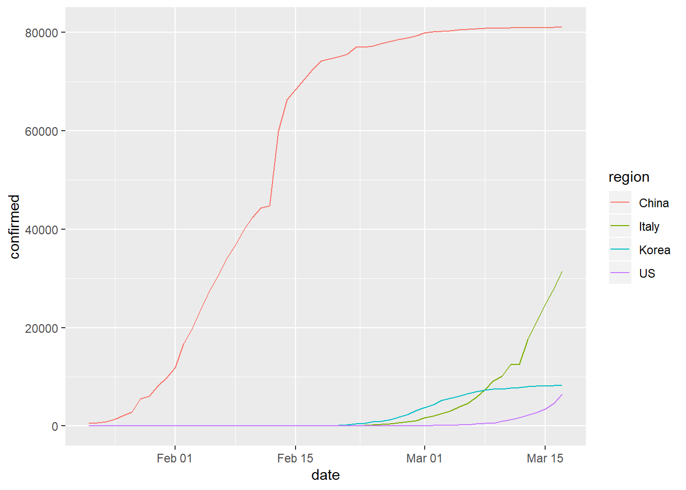
Effective Communication
What we produced before was a simple plot but let’s do a little better. Can we bring focus to the rate of change to see accelerating illness? This could perhaps highlight times where each region experienced an increased infection rate. To do this, we will need to add a new calculated column where each count is compared to the previous value.
#create a new data set 'mutated' which has a new rate column
mutated<-pivoted %>%
  group_by(region) %>%
  arrange(region, date) %>%
  mutate(rate = 100 * (confirmed - lag(confirmed))/lag(confirmed)) %>%
  ungroup()

#preview
kable(mutated) %>%
  kable_styling() %>%
scroll_box(width = "100%", height = "300px")| region | date | confirmed | rate |
|---|---|---|---|
| China | 2020-01-22 | 548 | NA |
| China | 2020-01-23 | 643 | 17.3357664 |
| China | 2020-01-24 | 920 | 43.0793157 |
| China | 2020-01-25 | 1406 | 52.8260870 |
| China | 2020-01-26 | 2075 | 47.5817923 |
| China | 2020-01-27 | 2877 | 38.6506024 |
| China | 2020-01-28 | 5509 | 91.4841849 |
| China | 2020-01-29 | 6087 | 10.4919223 |
| China | 2020-01-30 | 8141 | 33.7440447 |
| China | 2020-01-31 | 9802 | 20.4028989 |
| China | 2020-02-01 | 11891 | 21.3119771 |
| China | 2020-02-02 | 16630 | 39.8536708 |
| China | 2020-02-03 | 19716 | 18.5568250 |
| China | 2020-02-04 | 23707 | 20.2424427 |
| China | 2020-02-05 | 27440 | 15.7464040 |
| China | 2020-02-06 | 30587 | 11.4686589 |
| China | 2020-02-07 | 34110 | 11.5179651 |
| China | 2020-02-08 | 36814 | 7.9272940 |
| China | 2020-02-09 | 39829 | 8.1898191 |
| China | 2020-02-10 | 42354 | 6.3396018 |
| China | 2020-02-11 | 44386 | 4.7976578 |
| China | 2020-02-12 | 44759 | 0.8403551 |
| China | 2020-02-13 | 59895 | 33.8166626 |
| China | 2020-02-14 | 66358 | 10.7905501 |
| China | 2020-02-15 | 68413 | 3.0968384 |
| China | 2020-02-16 | 70513 | 3.0695920 |
| China | 2020-02-17 | 72434 | 2.7243203 |
| China | 2020-02-18 | 74211 | 2.4532678 |
| China | 2020-02-19 | 74619 | 0.5497837 |
| China | 2020-02-20 | 75077 | 0.6137847 |
| China | 2020-02-21 | 75550 | 0.6300198 |
| China | 2020-02-22 | 77001 | 1.9205824 |
| China | 2020-02-23 | 77022 | 0.0272724 |
| China | 2020-02-24 | 77241 | 0.2843343 |
| China | 2020-02-25 | 77754 | 0.6641550 |
| China | 2020-02-26 | 78166 | 0.5298763 |
| China | 2020-02-27 | 78600 | 0.5552286 |
| China | 2020-02-28 | 78928 | 0.4173028 |
| China | 2020-02-29 | 79356 | 0.5422664 |
| China | 2020-03-01 | 79932 | 0.7258430 |
| China | 2020-03-02 | 80136 | 0.2552169 |
| China | 2020-03-03 | 80261 | 0.1559848 |
| China | 2020-03-04 | 80386 | 0.1557419 |
| China | 2020-03-05 | 80537 | 0.1878437 |
| China | 2020-03-06 | 80690 | 0.1899748 |
| China | 2020-03-07 | 80770 | 0.0991449 |
| China | 2020-03-08 | 80823 | 0.0656184 |
| China | 2020-03-09 | 80860 | 0.0457790 |
| China | 2020-03-10 | 80887 | 0.0333910 |
| China | 2020-03-11 | 80921 | 0.0420339 |
| China | 2020-03-12 | 80932 | 0.0135935 |
| China | 2020-03-13 | 80945 | 0.0160629 |
| China | 2020-03-14 | 80977 | 0.0395330 |
| China | 2020-03-15 | 81003 | 0.0321079 |
| China | 2020-03-16 | 81033 | 0.0370357 |
| China | 2020-03-17 | 81058 | 0.0308516 |
| Italy | 2020-01-22 | 0 | NA |
| Italy | 2020-01-23 | 0 | NaN |
| Italy | 2020-01-24 | 0 | NaN |
| Italy | 2020-01-25 | 0 | NaN |
| Italy | 2020-01-26 | 0 | NaN |
| Italy | 2020-01-27 | 0 | NaN |
| Italy | 2020-01-28 | 0 | NaN |
| Italy | 2020-01-29 | 0 | NaN |
| Italy | 2020-01-30 | 0 | NaN |
| Italy | 2020-01-31 | 2 | Inf |
| Italy | 2020-02-01 | 2 | 0.0000000 |
| Italy | 2020-02-02 | 2 | 0.0000000 |
| Italy | 2020-02-03 | 2 | 0.0000000 |
| Italy | 2020-02-04 | 2 | 0.0000000 |
| Italy | 2020-02-05 | 2 | 0.0000000 |
| Italy | 2020-02-06 | 2 | 0.0000000 |
| Italy | 2020-02-07 | 3 | 50.0000000 |
| Italy | 2020-02-08 | 3 | 0.0000000 |
| Italy | 2020-02-09 | 3 | 0.0000000 |
| Italy | 2020-02-10 | 3 | 0.0000000 |
| Italy | 2020-02-11 | 3 | 0.0000000 |
| Italy | 2020-02-12 | 3 | 0.0000000 |
| Italy | 2020-02-13 | 3 | 0.0000000 |
| Italy | 2020-02-14 | 3 | 0.0000000 |
| Italy | 2020-02-15 | 3 | 0.0000000 |
| Italy | 2020-02-16 | 3 | 0.0000000 |
| Italy | 2020-02-17 | 3 | 0.0000000 |
| Italy | 2020-02-18 | 3 | 0.0000000 |
| Italy | 2020-02-19 | 3 | 0.0000000 |
| Italy | 2020-02-20 | 3 | 0.0000000 |
| Italy | 2020-02-21 | 20 | 566.6666667 |
| Italy | 2020-02-22 | 62 | 210.0000000 |
| Italy | 2020-02-23 | 155 | 150.0000000 |
| Italy | 2020-02-24 | 229 | 47.7419355 |
| Italy | 2020-02-25 | 322 | 40.6113537 |
| Italy | 2020-02-26 | 453 | 40.6832298 |
| Italy | 2020-02-27 | 655 | 44.5916115 |
| Italy | 2020-02-28 | 888 | 35.5725191 |
| Italy | 2020-02-29 | 1128 | 27.0270270 |
| Italy | 2020-03-01 | 1694 | 50.1773050 |
| Italy | 2020-03-02 | 2036 | 20.1889020 |
| Italy | 2020-03-03 | 2502 | 22.8880157 |
| Italy | 2020-03-04 | 3089 | 23.4612310 |
| Italy | 2020-03-05 | 3858 | 24.8947880 |
| Italy | 2020-03-06 | 4636 | 20.1658891 |
| Italy | 2020-03-07 | 5883 | 26.8981881 |
| Italy | 2020-03-08 | 7375 | 25.3612103 |
| Italy | 2020-03-09 | 9172 | 24.3661017 |
| Italy | 2020-03-10 | 10149 | 10.6519843 |
| Italy | 2020-03-11 | 12462 | 22.7904227 |
| Italy | 2020-03-12 | 12462 | 0.0000000 |
| Italy | 2020-03-13 | 17660 | 41.7108008 |
| Italy | 2020-03-14 | 21157 | 19.8018120 |
| Italy | 2020-03-15 | 24747 | 16.9683793 |
| Italy | 2020-03-16 | 27980 | 13.0642098 |
| Italy | 2020-03-17 | 31506 | 12.6018585 |
| Korea | 2020-01-22 | 1 | NA |
| Korea | 2020-01-23 | 1 | 0.0000000 |
| Korea | 2020-01-24 | 2 | 100.0000000 |
| Korea | 2020-01-25 | 2 | 0.0000000 |
| Korea | 2020-01-26 | 3 | 50.0000000 |
| Korea | 2020-01-27 | 4 | 33.3333333 |
| Korea | 2020-01-28 | 4 | 0.0000000 |
| Korea | 2020-01-29 | 4 | 0.0000000 |
| Korea | 2020-01-30 | 4 | 0.0000000 |
| Korea | 2020-01-31 | 11 | 175.0000000 |
| Korea | 2020-02-01 | 12 | 9.0909091 |
| Korea | 2020-02-02 | 15 | 25.0000000 |
| Korea | 2020-02-03 | 15 | 0.0000000 |
| Korea | 2020-02-04 | 16 | 6.6666667 |
| Korea | 2020-02-05 | 19 | 18.7500000 |
| Korea | 2020-02-06 | 23 | 21.0526316 |
| Korea | 2020-02-07 | 24 | 4.3478261 |
| Korea | 2020-02-08 | 24 | 0.0000000 |
| Korea | 2020-02-09 | 25 | 4.1666667 |
| Korea | 2020-02-10 | 27 | 8.0000000 |
| Korea | 2020-02-11 | 28 | 3.7037037 |
| Korea | 2020-02-12 | 28 | 0.0000000 |
| Korea | 2020-02-13 | 28 | 0.0000000 |
| Korea | 2020-02-14 | 28 | 0.0000000 |
| Korea | 2020-02-15 | 28 | 0.0000000 |
| Korea | 2020-02-16 | 29 | 3.5714286 |
| Korea | 2020-02-17 | 30 | 3.4482759 |
| Korea | 2020-02-18 | 31 | 3.3333333 |
| Korea | 2020-02-19 | 31 | 0.0000000 |
| Korea | 2020-02-20 | 104 | 235.4838710 |
| Korea | 2020-02-21 | 204 | 96.1538462 |
| Korea | 2020-02-22 | 433 | 112.2549020 |
| Korea | 2020-02-23 | 602 | 39.0300231 |
| Korea | 2020-02-24 | 833 | 38.3720930 |
| Korea | 2020-02-25 | 977 | 17.2869148 |
| Korea | 2020-02-26 | 1261 | 29.0685773 |
| Korea | 2020-02-27 | 1766 | 40.0475813 |
| Korea | 2020-02-28 | 2337 | 32.3329558 |
| Korea | 2020-02-29 | 3150 | 34.7881900 |
| Korea | 2020-03-01 | 3736 | 18.6031746 |
| Korea | 2020-03-02 | 4335 | 16.0331906 |
| Korea | 2020-03-03 | 5186 | 19.6309112 |
| Korea | 2020-03-04 | 5621 | 8.3879676 |
| Korea | 2020-03-05 | 6088 | 8.3081302 |
| Korea | 2020-03-06 | 6593 | 8.2950066 |
| Korea | 2020-03-07 | 7041 | 6.7950857 |
| Korea | 2020-03-08 | 7314 | 3.8772902 |
| Korea | 2020-03-09 | 7478 | 2.2422751 |
| Korea | 2020-03-10 | 7513 | 0.4680396 |
| Korea | 2020-03-11 | 7755 | 3.2210835 |
| Korea | 2020-03-12 | 7869 | 1.4700193 |
| Korea | 2020-03-13 | 7979 | 1.3978905 |
| Korea | 2020-03-14 | 8086 | 1.3410202 |
| Korea | 2020-03-15 | 8162 | 0.9398961 |
| Korea | 2020-03-16 | 8236 | 0.9066405 |
| Korea | 2020-03-17 | 8320 | 1.0199126 |
| US | 2020-01-22 | 1 | NA |
| US | 2020-01-23 | 1 | 0.0000000 |
| US | 2020-01-24 | 2 | 100.0000000 |
| US | 2020-01-25 | 2 | 0.0000000 |
| US | 2020-01-26 | 5 | 150.0000000 |
| US | 2020-01-27 | 5 | 0.0000000 |
| US | 2020-01-28 | 5 | 0.0000000 |
| US | 2020-01-29 | 5 | 0.0000000 |
| US | 2020-01-30 | 5 | 0.0000000 |
| US | 2020-01-31 | 7 | 40.0000000 |
| US | 2020-02-01 | 8 | 14.2857143 |
| US | 2020-02-02 | 8 | 0.0000000 |
| US | 2020-02-03 | 11 | 37.5000000 |
| US | 2020-02-04 | 11 | 0.0000000 |
| US | 2020-02-05 | 11 | 0.0000000 |
| US | 2020-02-06 | 11 | 0.0000000 |
| US | 2020-02-07 | 11 | 0.0000000 |
| US | 2020-02-08 | 11 | 0.0000000 |
| US | 2020-02-09 | 11 | 0.0000000 |
| US | 2020-02-10 | 11 | 0.0000000 |
| US | 2020-02-11 | 12 | 9.0909091 |
| US | 2020-02-12 | 12 | 0.0000000 |
| US | 2020-02-13 | 13 | 8.3333333 |
| US | 2020-02-14 | 13 | 0.0000000 |
| US | 2020-02-15 | 13 | 0.0000000 |
| US | 2020-02-16 | 13 | 0.0000000 |
| US | 2020-02-17 | 13 | 0.0000000 |
| US | 2020-02-18 | 13 | 0.0000000 |
| US | 2020-02-19 | 13 | 0.0000000 |
| US | 2020-02-20 | 13 | 0.0000000 |
| US | 2020-02-21 | 15 | 15.3846154 |
| US | 2020-02-22 | 15 | 0.0000000 |
| US | 2020-02-23 | 15 | 0.0000000 |
| US | 2020-02-24 | 51 | 240.0000000 |
| US | 2020-02-25 | 51 | 0.0000000 |
| US | 2020-02-26 | 57 | 11.7647059 |
| US | 2020-02-27 | 58 | 1.7543860 |
| US | 2020-02-28 | 60 | 3.4482759 |
| US | 2020-02-29 | 68 | 13.3333333 |
| US | 2020-03-01 | 74 | 8.8235294 |
| US | 2020-03-02 | 98 | 32.4324324 |
| US | 2020-03-03 | 118 | 20.4081633 |
| US | 2020-03-04 | 149 | 26.2711864 |
| US | 2020-03-05 | 217 | 45.6375839 |
| US | 2020-03-06 | 262 | 20.7373272 |
| US | 2020-03-07 | 402 | 53.4351145 |
| US | 2020-03-08 | 518 | 28.8557214 |
| US | 2020-03-09 | 583 | 12.5482625 |
| US | 2020-03-10 | 959 | 64.4939966 |
| US | 2020-03-11 | 1281 | 33.5766423 |
| US | 2020-03-12 | 1663 | 29.8204528 |
| US | 2020-03-13 | 2179 | 31.0282622 |
| US | 2020-03-14 | 2727 | 25.1491510 |
| US | 2020-03-15 | 3499 | 28.3094976 |
| US | 2020-03-16 | 4632 | 32.3806802 |
| US | 2020-03-17 | 6421 | 38.6226252 |
Let’s make a new plot using points where transparency is based on the rate value and a cutoff value. For example, solid color if the rate is x% or more. Is a small rate value more or less important as total confirmed cases increases to very high levels?
#set the cutoff percent
cutoff=10

#plot
plot<-ggplot(data=mutated, aes(x=date, y=confirmed, col=region)) +
  geom_point(aes(alpha = ifelse(rate > cutoff, 1, ifelse(rate <= cutoff,0.5, 0.5)))) +
  theme(legend.position = "none")
plot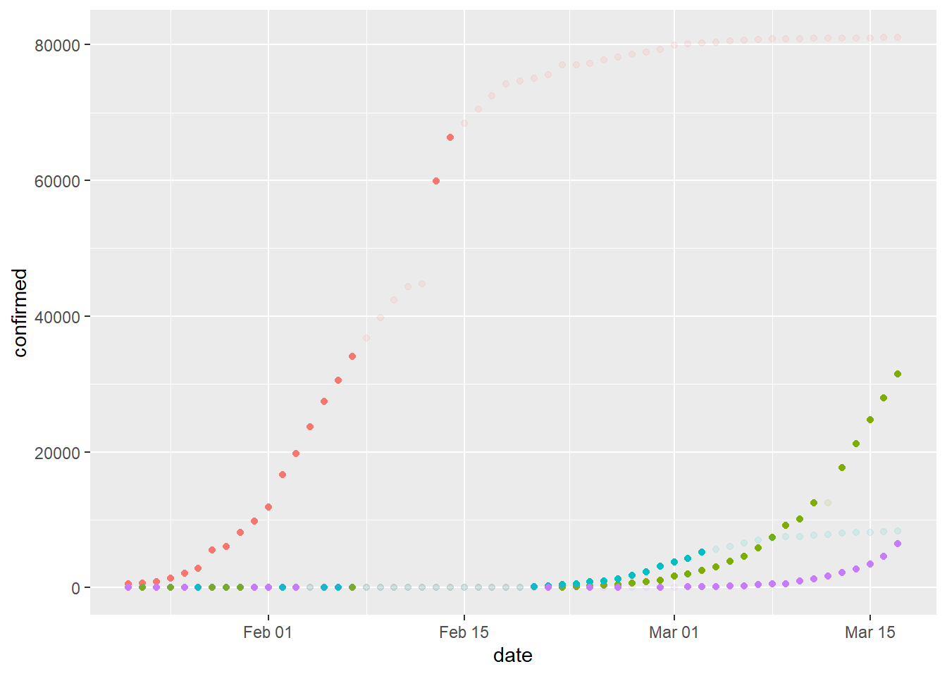
We can split this plot by region for some clarity.
cutoff=50
plot<-ggplot(data=mutated, aes(x=date, y=confirmed, col=region)) +
  geom_point(aes(alpha = ifelse(rate > cutoff, 1, ifelse(rate <= cutoff,0.5, 0.5)))) +
  theme(legend.position = "none")+
  facet_wrap( ~ region, ncol=2)
plot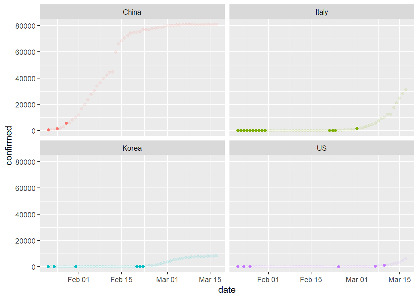
Each solid-color dot represents a relatively high rate of change. What’s happening with the United States? What can we conclude from this plot?
Using Movement for Communication
Movement can be powerful for communicating ideas when color, size, and position are not sufficient. Let’s examine the number of confirmed COVID-19 cases in our four regions of interest through the use of animated plots. Do you notice anything new or different? What predictions might you make from this information?
#NOTE: Must run RStudio as administrator for write permissions to work properly
#also installed gifski and png libraries to unknown effect due to suggested actions
library(gganimate)

#set up the plot
plot<-ggplot(pivoted, aes(date, confirmed, colour = region)) +
  geom_line(lwd=1) +
  geom_segment(aes(xend = date, yend = confirmed), linetype = 2, colour = 'grey') +
  geom_point(alpha = 0.7, size=3) +
  geom_text(aes(x = max(date), label = region), hjust = 0,show.legend = FALSE) +
  transition_reveal(date) +
  coord_cartesian(clip = 'off') +
  labs(title = 'COVID-19 Confirmed Cases', y = 'Count', x = 'Date', colour='Region') +
  theme_minimal() +
  theme(plot.margin = margin(5.5, 40, 5.5, 5.5))

#save the plot as a .gif
anim_save("chinaItalyKoreaUS.gif", plot)
##
Frame 1 (1%)
Frame 2 (2%)
Frame 3 (3%)
Frame 4 (4%)
Frame 5 (5%)
Frame 6 (6%)
Frame 7 (7%)
Frame 8 (8%)
Frame 9 (9%)
Frame 10 (10%)
Frame 11 (11%)
Frame 12 (12%)
Frame 13 (13%)
Frame 14 (14%)
Frame 15 (15%)
Frame 16 (16%)
Frame 17 (17%)
Frame 18 (18%)
Frame 19 (19%)
Frame 20 (20%)
Frame 21 (21%)
Frame 22 (22%)
Frame 23 (23%)
Frame 24 (24%)
Frame 25 (25%)
Frame 26 (26%)
Frame 27 (27%)
Frame 28 (28%)
Frame 29 (29%)
Frame 30 (30%)
Frame 31 (31%)
Frame 32 (32%)
Frame 33 (33%)
Frame 34 (34%)
Frame 35 (35%)
Frame 36 (36%)
Frame 37 (37%)
Frame 38 (38%)
Frame 39 (39%)
Frame 40 (40%)
Frame 41 (41%)
Frame 42 (42%)
Frame 43 (43%)
Frame 44 (44%)
Frame 45 (45%)
Frame 46 (46%)
Frame 47 (47%)
Frame 48 (48%)
Frame 49 (49%)
Frame 50 (50%)
Frame 51 (51%)
Frame 52 (52%)
Frame 53 (53%)
Frame 54 (54%)
Frame 55 (55%)
Frame 56 (56%)
Frame 57 (57%)
Frame 58 (58%)
Frame 59 (59%)
Frame 60 (60%)
Frame 61 (61%)
Frame 62 (62%)
Frame 63 (63%)
Frame 64 (64%)
Frame 65 (65%)
Frame 66 (66%)
Frame 67 (67%)
Frame 68 (68%)
Frame 69 (69%)
Frame 70 (70%)
Frame 71 (71%)
Frame 72 (72%)
Frame 73 (73%)
Frame 74 (74%)
Frame 75 (75%)
Frame 76 (76%)
Frame 77 (77%)
Frame 78 (78%)
Frame 79 (79%)
Frame 80 (80%)
Frame 81 (81%)
Frame 82 (82%)
Frame 83 (83%)
Frame 84 (84%)
Frame 85 (85%)
Frame 86 (86%)
Frame 87 (87%)
Frame 88 (88%)
Frame 89 (89%)
Frame 90 (90%)
Frame 91 (91%)
Frame 92 (92%)
Frame 93 (93%)
Frame 94 (94%)
Frame 95 (95%)
Frame 96 (96%)
Frame 97 (97%)
Frame 98 (98%)
Frame 99 (99%)
Frame 100 (100%)
## Finalizing encoding... done!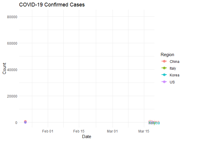
Case Study: Italy, South Korea, United States
Reports indicate massive and widespread SARS-CoV-2 testing in South Korea with relatively little testing in Italy and the United States. How might this methodology impact the rate of infection in each population? Let’s take a look at those regions specifically.
“As of Wednesday (3/18/2020), South Korea had tested over 295,000 people for the coronavirus, reporting over 8,500 infections with 81 deaths.” - Grady McGregor, Fortune Magazine.
According to an article published by the New York Times, the US and Italy have tested approximately 25,000 and 28,000 in a similar time frame, respectively.
Populations sizes are not the same so we can think of this in terms of density. That is, how many tests are each country performing per unit of population? Data indicate that the US is testing at a rate of around 100 tests per 1 million people. Italy is testing around 2,100 per million and South Korea is testing around 5,200 per million.
South Korea is effectively testing for the virus at a rate of approximately 25x that of Italy and 50X or more than that of the US.
What are some possible implications in this disparity of testing rates?
#filter for only three regions
filterPivot<-filter(pivoted, region %in% c("Italy", "Korea" , "US"))

#set up the plot
plot<-ggplot(filterPivot, aes(date, confirmed, colour = region)) +
  geom_line(lwd=1) +
  geom_segment(aes(xend = date, yend = confirmed), linetype = 2, colour = 'grey') +
  geom_point(alpha = 0.7, size=3) +
  geom_text(aes(x = max(date), label = region), hjust = 0,show.legend = FALSE) +
  transition_reveal(date) +
  coord_cartesian(clip = 'off') +
  labs(title = 'COVID-19 Confirmed Cases', y = 'Count', x = 'Date', colour='Region') +
  theme_minimal() +
  theme(plot.margin = margin(5.5, 40, 5.5, 5.5))

#save the plot as a .gif
anim_save("italyKoreaUS.gif", plot)
##
Frame 1 (1%)
Frame 2 (2%)
Frame 3 (3%)
Frame 4 (4%)
Frame 5 (5%)
Frame 6 (6%)
Frame 7 (7%)
Frame 8 (8%)
Frame 9 (9%)
Frame 10 (10%)
Frame 11 (11%)
Frame 12 (12%)
Frame 13 (13%)
Frame 14 (14%)
Frame 15 (15%)
Frame 16 (16%)
Frame 17 (17%)
Frame 18 (18%)
Frame 19 (19%)
Frame 20 (20%)
Frame 21 (21%)
Frame 22 (22%)
Frame 23 (23%)
Frame 24 (24%)
Frame 25 (25%)
Frame 26 (26%)
Frame 27 (27%)
Frame 28 (28%)
Frame 29 (29%)
Frame 30 (30%)
Frame 31 (31%)
Frame 32 (32%)
Frame 33 (33%)
Frame 34 (34%)
Frame 35 (35%)
Frame 36 (36%)
Frame 37 (37%)
Frame 38 (38%)
Frame 39 (39%)
Frame 40 (40%)
Frame 41 (41%)
Frame 42 (42%)
Frame 43 (43%)
Frame 44 (44%)
Frame 45 (45%)
Frame 46 (46%)
Frame 47 (47%)
Frame 48 (48%)
Frame 49 (49%)
Frame 50 (50%)
Frame 51 (51%)
Frame 52 (52%)
Frame 53 (53%)
Frame 54 (54%)
Frame 55 (55%)
Frame 56 (56%)
Frame 57 (57%)
Frame 58 (58%)
Frame 59 (59%)
Frame 60 (60%)
Frame 61 (61%)
Frame 62 (62%)
Frame 63 (63%)
Frame 64 (64%)
Frame 65 (65%)
Frame 66 (66%)
Frame 67 (67%)
Frame 68 (68%)
Frame 69 (69%)
Frame 70 (70%)
Frame 71 (71%)
Frame 72 (72%)
Frame 73 (73%)
Frame 74 (74%)
Frame 75 (75%)
Frame 76 (76%)
Frame 77 (77%)
Frame 78 (78%)
Frame 79 (79%)
Frame 80 (80%)
Frame 81 (81%)
Frame 82 (82%)
Frame 83 (83%)
Frame 84 (84%)
Frame 85 (85%)
Frame 86 (86%)
Frame 87 (87%)
Frame 88 (88%)
Frame 89 (89%)
Frame 90 (90%)
Frame 91 (91%)
Frame 92 (92%)
Frame 93 (93%)
Frame 94 (94%)
Frame 95 (95%)
Frame 96 (96%)
Frame 97 (97%)
Frame 98 (98%)
Frame 99 (99%)
Frame 100 (100%)
## Finalizing encoding... done!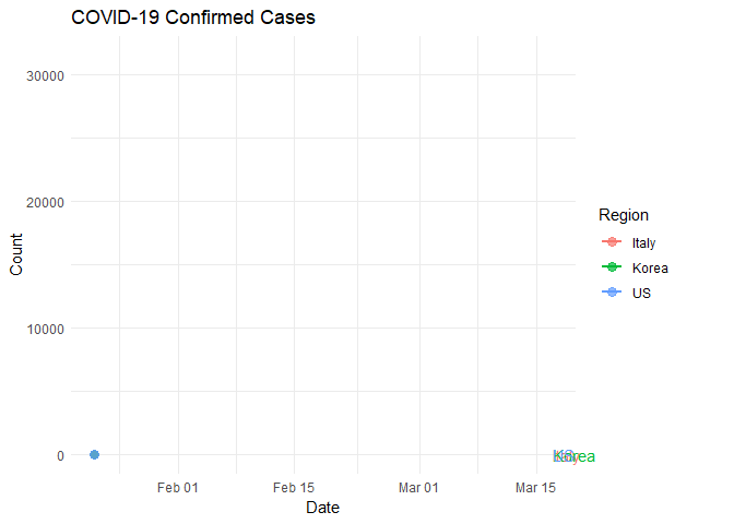
Look closely and notice that Italy and South Korea started their rapid increase in infection rate at approximately the same time. What happened around March 7?
#filter for only three regions
filterPivot<-filter(pivoted, region %in% c("Italy", "Korea"))

#set up the plot
plot<-ggplot(filterPivot, aes(date, confirmed, colour = region)) +
  geom_line(lwd=1) +
  geom_segment(aes(xend = date, yend = confirmed), linetype = 2, colour = 'grey') +
  geom_point(alpha = 0.7, size=3) +
  geom_text(aes(x = max(date), label = region), hjust = 0,show.legend = FALSE) +
  transition_reveal(date) +
  coord_cartesian(clip = 'off') +
  labs(title = 'COVID-19 Confirmed Cases', y = 'Count', x = 'Date', colour='Region') +
  theme_minimal() +
  theme(plot.margin = margin(5.5, 40, 5.5, 5.5))

#save the plot as a .gif
anim_save("italyKorea.gif", plot)
##
Frame 1 (1%)
Frame 2 (2%)
Frame 3 (3%)
Frame 4 (4%)
Frame 5 (5%)
Frame 6 (6%)
Frame 7 (7%)
Frame 8 (8%)
Frame 9 (9%)
Frame 10 (10%)
Frame 11 (11%)
Frame 12 (12%)
Frame 13 (13%)
Frame 14 (14%)
Frame 15 (15%)
Frame 16 (16%)
Frame 17 (17%)
Frame 18 (18%)
Frame 19 (19%)
Frame 20 (20%)
Frame 21 (21%)
Frame 22 (22%)
Frame 23 (23%)
Frame 24 (24%)
Frame 25 (25%)
Frame 26 (26%)
Frame 27 (27%)
Frame 28 (28%)
Frame 29 (29%)
Frame 30 (30%)
Frame 31 (31%)
Frame 32 (32%)
Frame 33 (33%)
Frame 34 (34%)
Frame 35 (35%)
Frame 36 (36%)
Frame 37 (37%)
Frame 38 (38%)
Frame 39 (39%)
Frame 40 (40%)
Frame 41 (41%)
Frame 42 (42%)
Frame 43 (43%)
Frame 44 (44%)
Frame 45 (45%)
Frame 46 (46%)
Frame 47 (47%)
Frame 48 (48%)
Frame 49 (49%)
Frame 50 (50%)
Frame 51 (51%)
Frame 52 (52%)
Frame 53 (53%)
Frame 54 (54%)
Frame 55 (55%)
Frame 56 (56%)
Frame 57 (57%)
Frame 58 (58%)
Frame 59 (59%)
Frame 60 (60%)
Frame 61 (61%)
Frame 62 (62%)
Frame 63 (63%)
Frame 64 (64%)
Frame 65 (65%)
Frame 66 (66%)
Frame 67 (67%)
Frame 68 (68%)
Frame 69 (69%)
Frame 70 (70%)
Frame 71 (71%)
Frame 72 (72%)
Frame 73 (73%)
Frame 74 (74%)
Frame 75 (75%)
Frame 76 (76%)
Frame 77 (77%)
Frame 78 (78%)
Frame 79 (79%)
Frame 80 (80%)
Frame 81 (81%)
Frame 82 (82%)
Frame 83 (83%)
Frame 84 (84%)
Frame 85 (85%)
Frame 86 (86%)
Frame 87 (87%)
Frame 88 (88%)
Frame 89 (89%)
Frame 90 (90%)
Frame 91 (91%)
Frame 92 (92%)
Frame 93 (93%)
Frame 94 (94%)
Frame 95 (95%)
Frame 96 (96%)
Frame 97 (97%)
Frame 98 (98%)
Frame 99 (99%)
Frame 100 (100%)
## Finalizing encoding... done!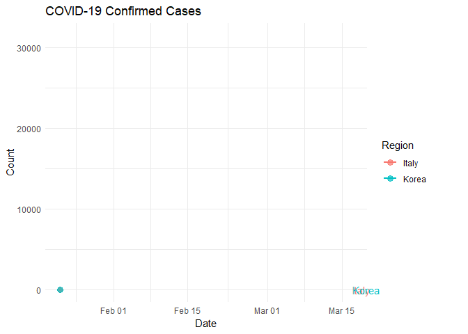
Something to remember
Higher testing rates can result in a higher number of reported infections. It makes sense that if you are not looking, you will not find a result and if you look very carefully, you have a higher probability of finding that for which you are looking.
How might this change your view of the accuracy of infection rate data from the US versus Italy, South Korea?
How might US data change if testing density increased from 100 per million to a more aggresive rate of 5,000 or more per million like South Korea?
Spatial Data Visualization
The spread of Sars-CoV-2 is a global event and you may be interested to think of this event in terms of geography. We can use the ‘leaflet’ library to display latitude and longitude data included in the data set. While this virus is spreading globally, we will focus on the United States for this visualization. Our primary questions will be where, when, and to what extent does this virus appear in the United States?
Leaflet Map
Here is an interactive map showing all of our data points. The point radius size represents the number of confirmed infections. One problem with this is that the map shows all points for all locations stacked on top of eachother and does not really represent the time aspect of the data set very well.
How would you represent time AND spatial distribution on a map?
library(leaflet)

#filter new data set
#we will now make use of the lat and long data
filtered<-select(filter(confirmed, region %in% c("US")), -c('Province/State'))
filtered
## # A tibble: 247 x 59
## region Lat Long `1/22/20` `1/23/20` `1/24/20` `1/25/20` `1/26/20` `1/27/20` `1/28/20` `1/29/20` `1/30/20` `1/31/20` `2/1/20`
## <chr> <dbl> <dbl> <dbl> <dbl> <dbl> <dbl> <dbl> <dbl> <dbl> <dbl> <dbl> <dbl> <dbl>
## 1 US 47.4 -121. 0 0 0 0 0 0 0 0 0 0 0
## 2 US 42.2 -74.9 0 0 0 0 0 0 0 0 0 0 0
## 3 US 36.1 -120. 0 0 0 0 0 0 0 0 0 0 0
## 4 US 42.2 -71.5 0 0 0 0 0 0 0 0 0 0 0
## 5 US 35.4 140. 0 0 0 0 0 0 0 0 0 0 0
## 6 US 37.6 -123. 0 0 0 0 0 0 0 0 0 0 0
## 7 US 33.0 -83.6 0 0 0 0 0 0 0 0 0 0 0
## 8 US 39.1 -105. 0 0 0 0 0 0 0 0 0 0 0
## 9 US 27.8 -81.7 0 0 0 0 0 0 0 0 0 0 0
## 10 US 40.3 -74.5 0 0 0 0 0 0 0 0 0 0 0
## # ... with 237 more rows, and 45 more variables: `2/2/20` <dbl>, `2/3/20` <dbl>, `2/4/20` <dbl>, `2/5/20` <dbl>, `2/6/20` <dbl>,
## # `2/7/20` <dbl>, `2/8/20` <dbl>, `2/9/20` <dbl>, `2/10/20` <dbl>, `2/11/20` <dbl>, `2/12/20` <dbl>, `2/13/20` <dbl>,
## # `2/14/20` <dbl>, `2/15/20` <dbl>, `2/16/20` <dbl>, `2/17/20` <dbl>, `2/18/20` <dbl>, `2/19/20` <dbl>, `2/20/20` <dbl>,
## # `2/21/20` <dbl>, `2/22/20` <dbl>, `2/23/20` <dbl>, `2/24/20` <dbl>, `2/25/20` <dbl>, `2/26/20` <dbl>, `2/27/20` <dbl>,
## # `2/28/20` <dbl>, `2/29/20` <dbl>, `3/1/20` <dbl>, `3/2/20` <dbl>, `3/3/20` <dbl>, `3/4/20` <dbl>, `3/5/20` <dbl>,
## # `3/6/20` <dbl>, `3/7/20` <dbl>, `3/8/20` <dbl>, `3/9/20` <dbl>, `3/10/20` <dbl>, `3/11/20` <dbl>, `3/12/20` <dbl>,
## # `3/13/20` <dbl>, `3/14/20` <dbl>, `3/15/20` <dbl>, `3/16/20` <dbl>, `3/17/20` <dbl>#pivot and force dates as date type
pivoted<-filtered %>% pivot_longer(-c(region,Lat,Long), names_to = "date", values_to = "confirmed")
pivoted$date<-as.Date(pivoted$date, "%m/%d/%y")
pivoted## # A tibble: 13,832 x 5
## region Lat Long date confirmed
## <chr> <dbl> <dbl> <date> <dbl>
## 1 US 47.4 -121. 2020-01-22 0
## 2 US 47.4 -121. 2020-01-23 0
## 3 US 47.4 -121. 2020-01-24 0
## 4 US 47.4 -121. 2020-01-25 0
## 5 US 47.4 -121. 2020-01-26 0
## 6 US 47.4 -121. 2020-01-27 0
## 7 US 47.4 -121. 2020-01-28 0
## 8 US 47.4 -121. 2020-01-29 0
## 9 US 47.4 -121. 2020-01-30 0
## 10 US 47.4 -121. 2020-01-31 0
## # ... with 13,822 more rowsInteractive Map
To address the desire of having time and space represented simultaneously, it may be helpful to implement an interactive map where the user can control the view and the timeline through a slider control. This map was created using the library called ‘Shiny’ and the Leaflet library used before.
Additional Code & Tutorials
These modules were used for teacher professional development related to Ecology. Feel free to check them out and use them to build your knowledge of R and science data. Ecology Modules
References
Wickham, Hadley. 2009. Ggplot2: Elegant Graphics for Data Analysis. Springer-Verlag New York. http://ggplot2.org.