Chapter 2 Climate Data
2.1 Overview
A wealth of climate change information is available online and students should be encouraged to conduct their own investigations of topics they find interesting. As the theme of this activity is wind, a few NASA resources have been collected for review. Students are expected to draw inspiration from these resources for the purpose of creating a musical piece for performance with their PVC didgeridoo and/or paixiao.
2.2 Data Perceptualization
Quantitative data, in the form of a sea numbers, are usually messy, bloated, and difficult to understand without imposing some kind of order upon them. Humans therefore, tend to take advantage of our exceptional visual-spatial processing capabilities and create colorful visualizations to represent the data in a more meaningful way for easier understanding and communication across groups.
As an example, we can look at a land temperature data visualization presented by Rosenman (2017). In this plot, we see a few notable features. First, the x axis represents each the years 1850 to 2015. The y axis represents the Global Average Temperature in Celcius. Black data points are presented for each year, restricted to only the United States. Each data point is paired with error bars representing uncertainty in that calculated value. We can observe how the uncertainty, or the distance between the maximum and minimum value of the error bars decreases over time. This might be due to our increasing sophistication in measurement tools and perhaps the sheer number of data points collected each year. Another feature we see is the meandering line and blue shaded region. The line represents a smoothed average over time and the blue shaded region represents the 95% confidence interval around that average. This line and shaded region are used to provide an idea about a trend in the data set. Hopefully, this type of scatterplot visualization can more easily inform the viewer about any patterns in the data that might be of interest versus the raw data.
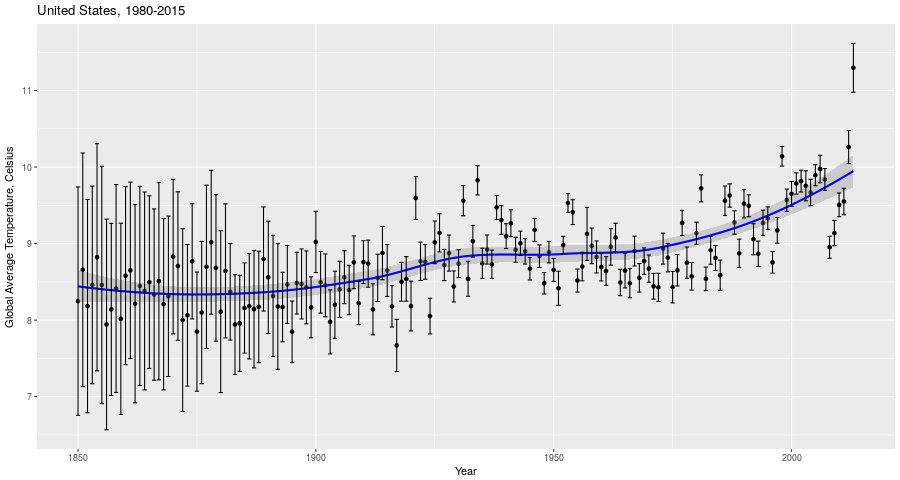
Figure 2.1: Global Average Temperature by Year, United States
Visualization is not the only method for understanding data, however. We may also use a process called sonification (Nees and Walker (2012)) to transform data into sound. This method offers advantages over visualization for recognition of time-based patterns and changes. This is important when dealing with very long time frames on the geologic time scale.
As an example of a sonfication of climate data for popular consumption, listen to “134 Years of Global Temperature Change in 14 Seconds” by Nelson Guda (Guda (n.d.)) for [Threshold] (https://nelsonguda.com/project/threshold/), a data art project about climate change. In this piece, “the piano notes are the annual temperature data from 1850-2015”," and “the orchestra plays chords made of the minimum, mean and maximum temperatures for eight year intervals over that time period.” The data are sourced from the Berkeley Earth Data site (Study (n.d.)).
2.3 Additional resources
Please see the “Data Presentation” in Supplemental Documents for some useful material that may help you get started.
In addition, the following links may be helpful for further exploration of climate data:
References
Guda, Nelson. n.d. “Threshold.” nelsonguda.com. https://nelsonguda.com/project/threshold/.
Nees, Michael, and Bruce Walker. 2012. “Theory of Sonification.” In, 9–39. http://sonify.psych.gatech.edu/~ben/references/nees_theory_of_sonification.pdf.
Rosenman, Dave. 2017. “Climate Change: Land Temperature Data, 1850-2015.” kaggle.com. https://www.kaggle.com/daverosenman/climate-change-land-temperature-data-1850-2015/data.
Study, The Berkeley Earth Surface Temperature. n.d. “Berkeley Earth Data.” berkeleyearth.org. http://berkeleyearth.org/data/.