Seminar II: Data Visualization
Thinking about Data
Let’s start by thinking about the following:
- What are data?
- How do we communicate our data to an audience?
- What audience cares about our data?
- What is a plot?
- What types of plots are there?
- What kinds of data are appropriate for which plots?
Organizing your data
In order to do effective research, you’ll need to organize any data such as observations, notes, quantitative values, and measurements. For numeric values, you will often use a table. For large sets of values, you will likely use a spreadsheet such as with Excel or Google Sheets.
Simple data sets can be stored as a table.
| id | date | value |
|---|---|---|
| 1 | 2020-07-01 | 0.335 |
| 2 | 2020-07-02 | 0.909 |
| 3 | 2020-07-03 | 0.412 |
| 4 | 2020-07-04 | 0.044 |
| 5 | 2020-07-05 | 0.764 |
| 6 | 2020-07-06 | 0.750 |
| 7 | 2020-07-07 | 0.800 |
| 8 | 2020-07-08 | 0.885 |
| 9 | 2020-07-09 | 0.449 |
| 10 | 2020-07-10 | 0.488 |
| 11 | 2020-07-11 | 0.946 |
| 12 | 2020-07-12 | 0.106 |
| 13 | 2020-07-13 | 0.383 |
| 14 | 2020-07-14 | 0.626 |
| 15 | 2020-07-15 | 0.578 |
| 16 | 2020-07-16 | 0.371 |
| 17 | 2020-07-17 | 0.893 |
| 18 | 2020-07-18 | 0.064 |
| 19 | 2020-07-19 | 0.236 |
| 20 | 2020-07-20 | 0.116 |
| 21 | 2020-07-21 | 0.473 |
| 22 | 2020-07-22 | 0.502 |
| 23 | 2020-07-23 | 0.635 |
| 24 | 2020-07-24 | 0.771 |
| 25 | 2020-07-25 | 0.104 |
| 26 | 2020-07-26 | 0.183 |
| 27 | 2020-07-27 | 0.873 |
| 28 | 2020-07-28 | 0.188 |
| 29 | 2020-07-29 | 0.111 |
| 30 | 2020-07-30 | 0.084 |
| 31 | 2020-07-31 | 0.942 |
| 32 | 2020-08-01 | 0.972 |
| 33 | 2020-08-02 | 0.529 |
| 34 | 2020-08-03 | 0.653 |
| 35 | 2020-08-04 | 0.120 |
| 36 | 2020-08-05 | 0.043 |
| 37 | 2020-08-06 | 0.056 |
| 38 | 2020-08-07 | 0.164 |
| 39 | 2020-08-08 | 0.227 |
| 40 | 2020-08-09 | 0.924 |
| 41 | 2020-08-10 | 0.686 |
| 42 | 2020-08-11 | 0.426 |
| 43 | 2020-08-12 | 0.499 |
| 44 | 2020-08-13 | 0.361 |
| 45 | 2020-08-14 | 0.496 |
| 46 | 2020-08-15 | 0.849 |
| 47 | 2020-08-16 | 0.724 |
| 48 | 2020-08-17 | 0.898 |
| 49 | 2020-08-18 | 0.460 |
| 50 | 2020-08-19 | 0.435 |
| 51 | 2020-08-20 | 0.406 |
| 52 | 2020-08-21 | 0.338 |
| 53 | 2020-08-22 | 0.519 |
| 54 | 2020-08-23 | 0.240 |
| 55 | 2020-08-24 | 0.617 |
| 56 | 2020-08-25 | 0.648 |
| 57 | 2020-08-26 | 0.202 |
| 58 | 2020-08-27 | 0.398 |
| 59 | 2020-08-28 | 0.085 |
| 60 | 2020-08-29 | 0.937 |
| 61 | 2020-08-30 | 0.556 |
| 62 | 2020-08-31 | 0.196 |
| 63 | 2020-09-01 | 0.746 |
| 64 | 2020-09-02 | 0.642 |
| 65 | 2020-09-03 | 0.871 |
| 66 | 2020-09-04 | 0.319 |
| 67 | 2020-09-05 | 0.317 |
| 68 | 2020-09-06 | 0.471 |
| 69 | 2020-09-07 | 0.803 |
| 70 | 2020-09-08 | 0.852 |
| 71 | 2020-09-09 | 0.226 |
| 72 | 2020-09-10 | 0.619 |
| 73 | 2020-09-11 | 0.430 |
| 74 | 2020-09-12 | 0.581 |
| 75 | 2020-09-13 | 0.774 |
| 76 | 2020-09-14 | 0.340 |
| 77 | 2020-09-15 | 0.594 |
| 78 | 2020-09-16 | 0.799 |
| 79 | 2020-09-17 | 0.898 |
| 80 | 2020-09-18 | 0.975 |
| 81 | 2020-09-19 | 0.442 |
| 82 | 2020-09-20 | 0.369 |
| 83 | 2020-09-21 | 0.882 |
| 84 | 2020-09-22 | 0.971 |
| 85 | 2020-09-23 | 0.662 |
| 86 | 2020-09-24 | 0.559 |
| 87 | 2020-09-25 | 0.220 |
| 88 | 2020-09-26 | 0.963 |
| 89 | 2020-09-27 | 0.763 |
| 90 | 2020-09-28 | 0.617 |
| 91 | 2020-09-29 | 0.540 |
| 92 | 2020-09-30 | 0.455 |
| 93 | 2020-10-01 | 0.850 |
| 94 | 2020-10-02 | 0.503 |
| 95 | 2020-10-03 | 0.800 |
| 96 | 2020-10-04 | 0.061 |
| 97 | 2020-10-05 | 0.536 |
| 98 | 2020-10-06 | 0.553 |
| 99 | 2020-10-07 | 0.508 |
| 100 | 2020-10-08 | 0.276 |
- Histograms
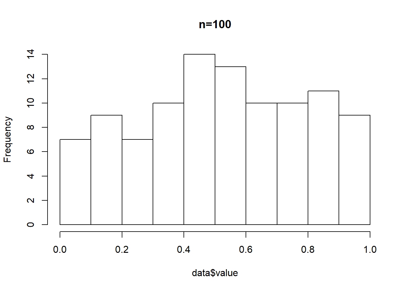
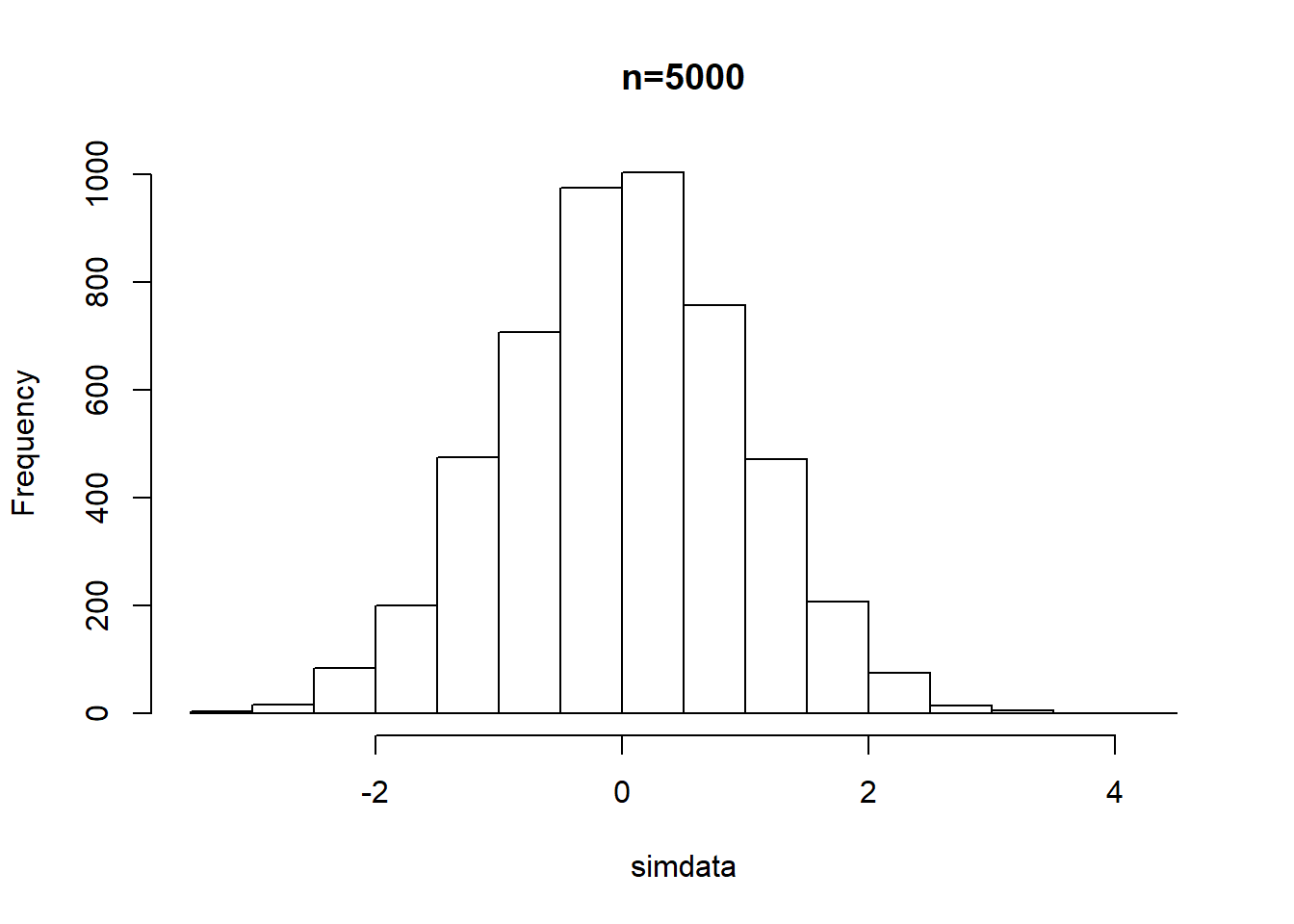
- Useful for examining the shape of the distribution. These are NOT bar charts because they display frequency and not counts, means, or other values.
Example: consider the set of values in the table. How many of those values are between 0 and 0.1? How many between 0.2 and 0.3? Are there relatively more large values or small values? Are the values distributed ‘normally’? A histogram will give us a clue.
- Scatterplot
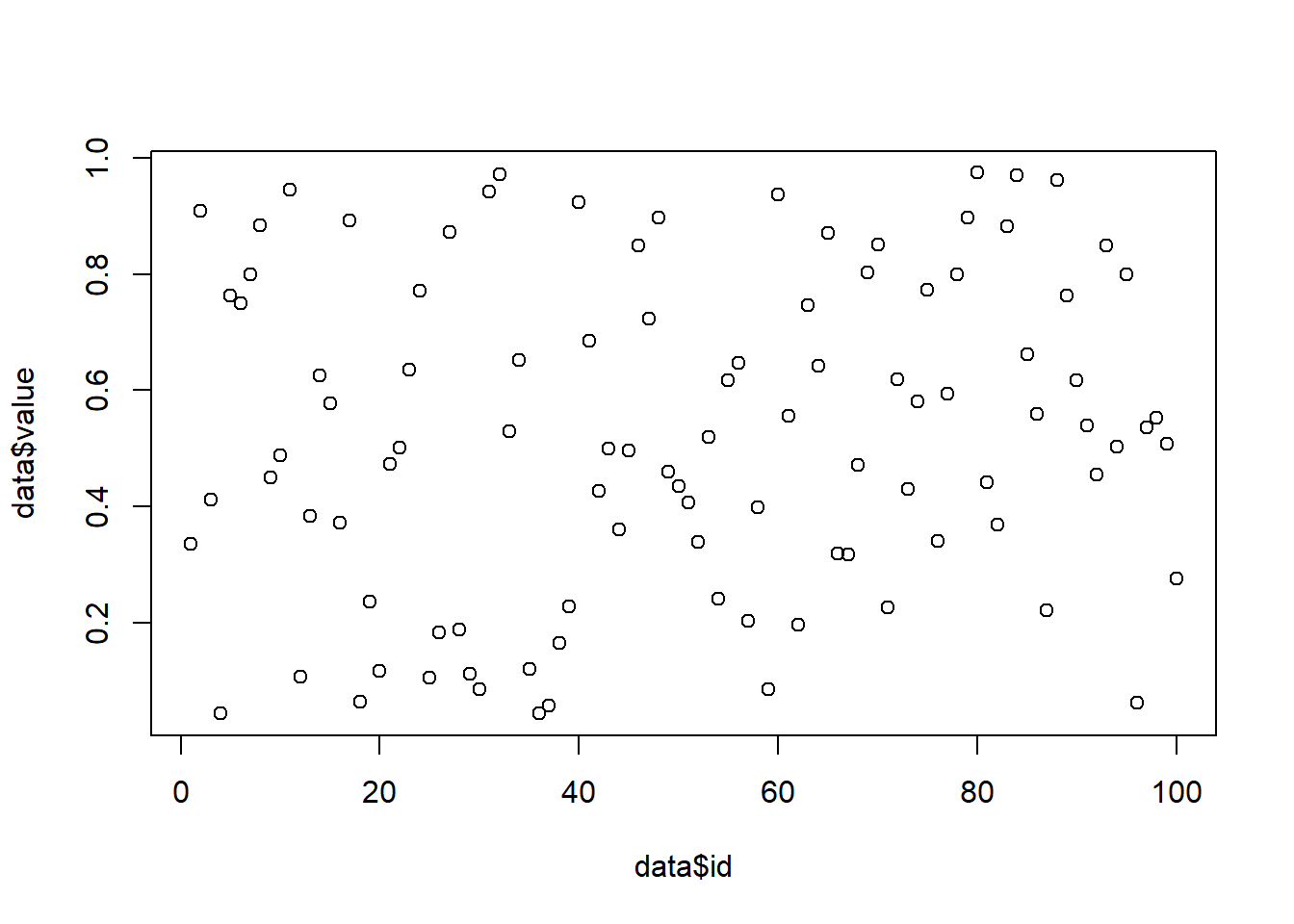
- Used to evaluate the relationship between two variables. Each data point is a coordinate represented by one member of each variable.
Example: Let’s examine the relationship between the ID of each data point and the value of each data point. Do you predict these might be related? If so, what would the plot look like? If not, what do you think the plot would look like?
- Bar chart
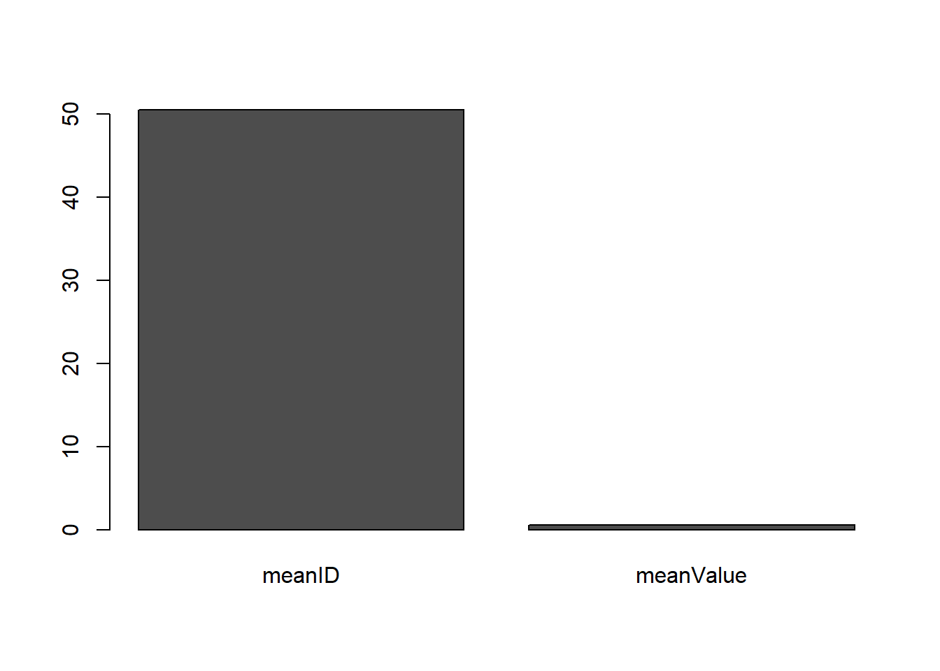
- Used to show the relationship of a numeric and categorical value such as totals, means, raw values, or similar quantities to allow for comparison. These often will have other decorations to help the viewer understand variability within the data set, such as ‘error bars’.
- Pie Chart
- Used ONLY to show percentage of a whole. Not recommended due to perception issues. Use a bar chart or a dot plot instead.
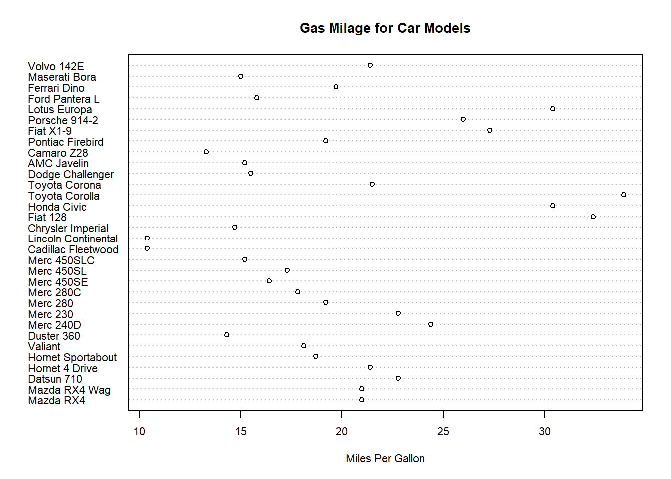
- Dot plot
- Displays frequency by category. Preferable to a pie chart.
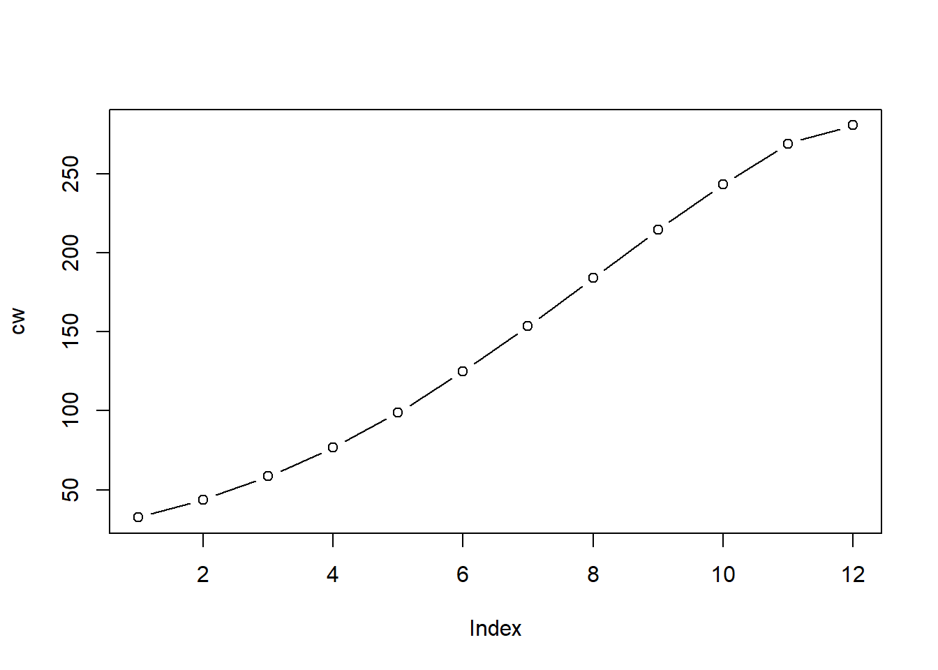
- Line plot
- Used to display a trend of a continuous variable, such as height, relative to another continuous variable, such as time. If your data are not continuous, consider a bar chart or similar type of plot. The line suggests there are data in between observations so be careful with that assumption.

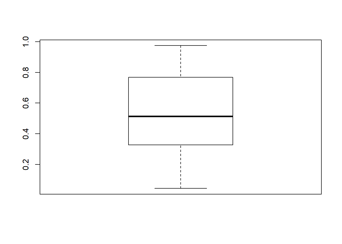
- Box plot
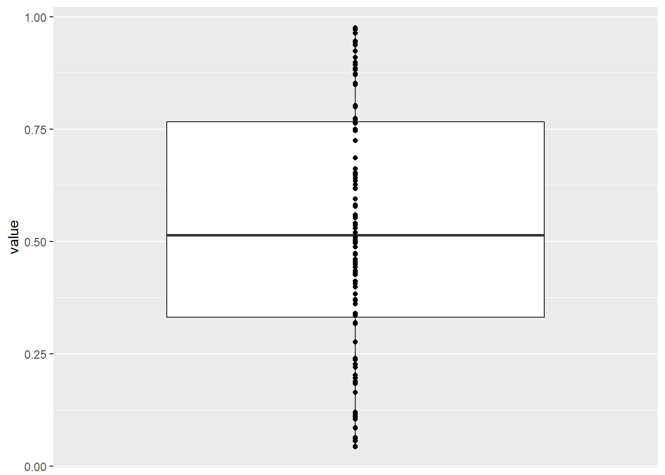
- Shows distribution and quartile information about a continuous data vector. Can be useful for comparing variables at a glance. Showing the data points provides additional useful information that can help viewers to interpret the data. Additional reading
- 3D plots
- Sometimes you need to show the relationship of three variables but this is somewhat rare. Excel and other programs offer options to ‘enhance’ your plots with shading, 3D effects, and other decorations that can be very distracting at best and misleading at worst. 3D plots are okay and even good if they are required to convey certain information, but 3D effects to entertain the viewer are not recommended.
Do you recall the volcano data that showed height as color? This is a time when 3D is justified. We can’t really understand the difference in height with color very well. It helps, but what if we did color AND 3D? AND we make it interactive? Super helpful!
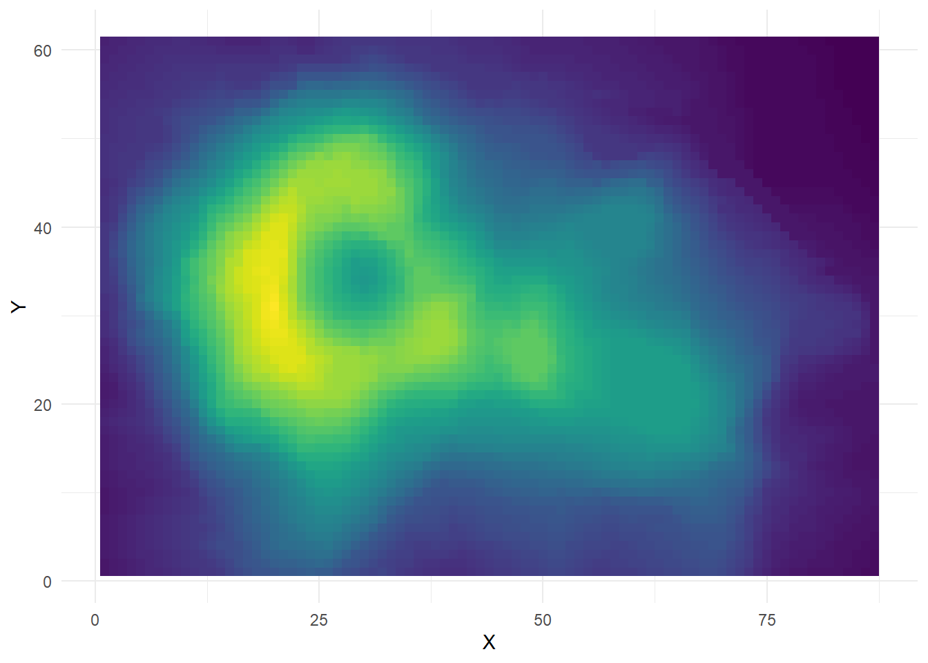
Here is the 3D interactive version. Source
Hands-on Plotting
Please open RStudio Cloud and navigate to the materials for Seminar 2. We will work through these activities together.