Design Philosophy for Scientific Communication
Introduction
Effective scientific communication requires attention to accuracy along with consideration for a simple message in what could otherwise be complicated content. In this module, we will explore some principles of design philosophy that may be useful to you as students and professionals. This list is not exhaustive and is intended as a starting point. At the end of this module, you should be capable of creating and explaining improved plots that are more-accurate, well-formatted charts designed to visualize biological data.
Data
The data sets used in this module include:
Marks
The ‘marks’ of a visualization are the main components independent of any decoration or placement.
- Points
- Lines
- Areas
Points
Let’s take a look at a simple example using the ‘ggplot2’ library and points.

Lines
Lines are another type of mark. What do the points and lines in this visualization of dolphins’ frequent associations represent?
Areas
If points are 0-dimensional, and lines are 1-dimensional, then areas are 2-dimensional. We won’t cover it here, but volumes are the next step with a 3-dimensional appearance. They have more limited use in data visualization, but do play a role. Areas represent two dimensions of data. Here we see the United States distribution of the tree species Sassafras albidum as an area plotted on a map. We use the ‘leaflet’ library to display the map and the ‘rgdal’ library to read in the shapefile data. This type of information is common in Geographic Information Systems (GIS) research.
Channels
- Position
- x,y coordinate
- represents: magnitude
- Size
- relative scale
- represents: magnitude
- Shape
- data point style
- represents: category
- Value
- greyscale value
- represents: magnitude
- Color
- hue
- represents: category, magnitude
Position
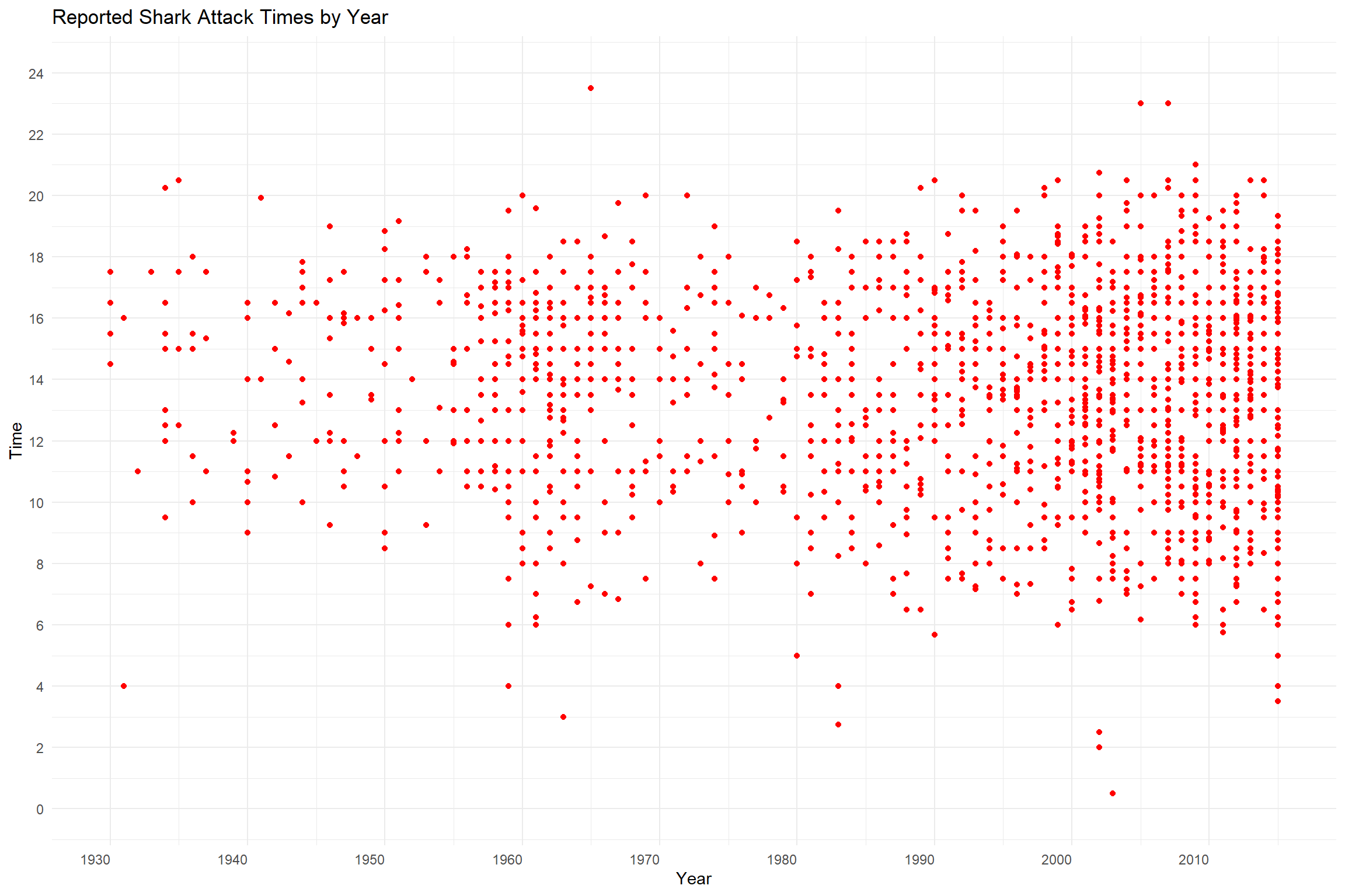
Position is a very strong channel and is used frequently to indicate differences in data. Here we see the magnitude along the X axis represent the year while the magnitude along the Y axis represents time of day. The position of each data point indicates the year and time of day of the recorded incident.
Size
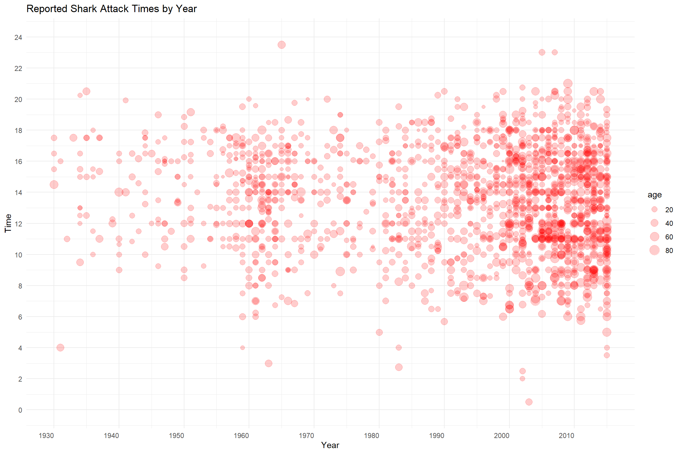
Size can be incorporated into a plot to indicate an additional variable. Here we see the magnitude along the X axis represent the year while the magnitude along the Y axis represents time of day. A third variable, age of the victim, is represented by the size of the data point. The alpha channel, or transparency, of the data point has been reduced from 1 to 0.1 to improve visibility. Do you think this is a good way to represent the data in this case? Why or why not?
Color
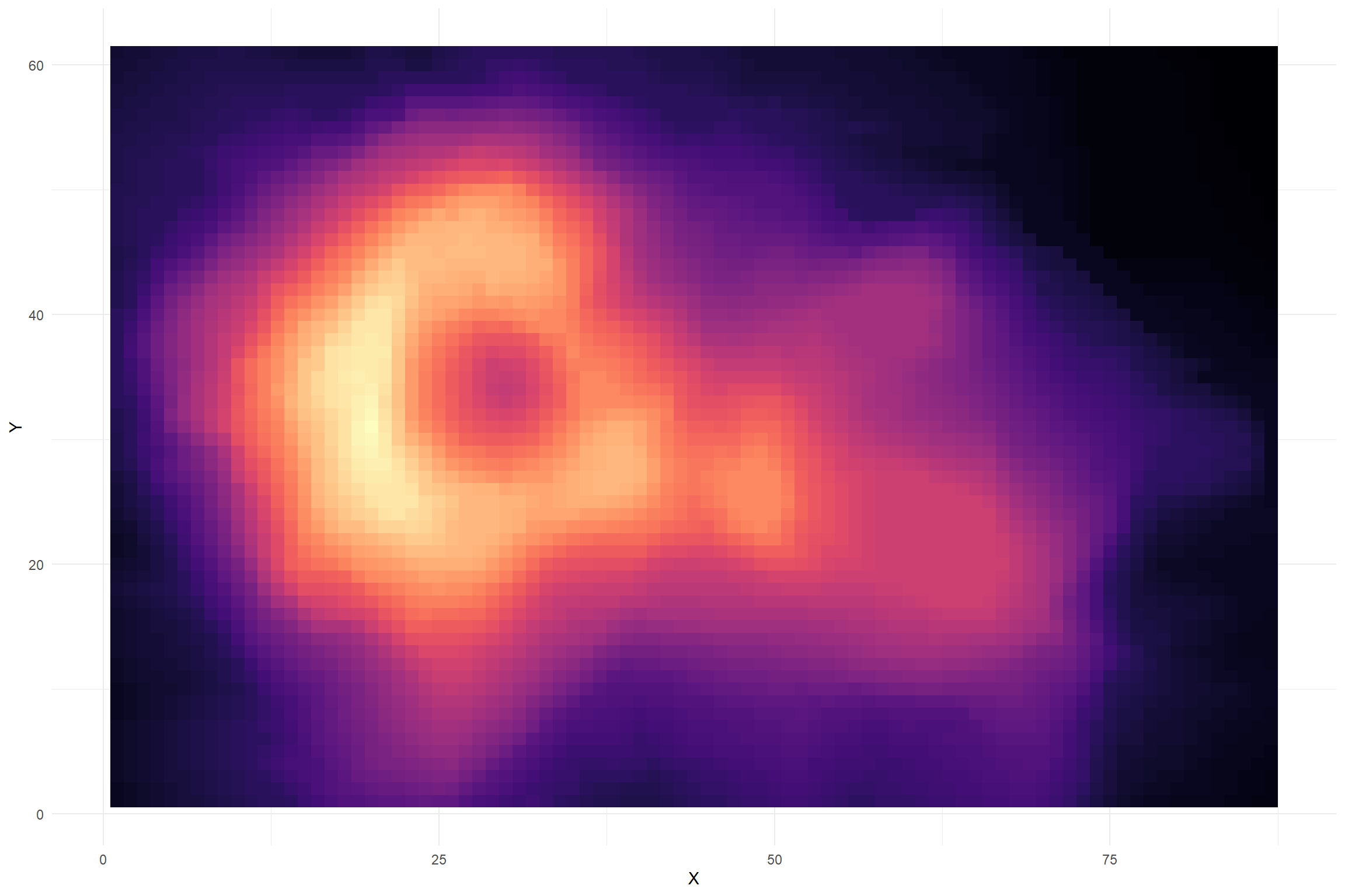
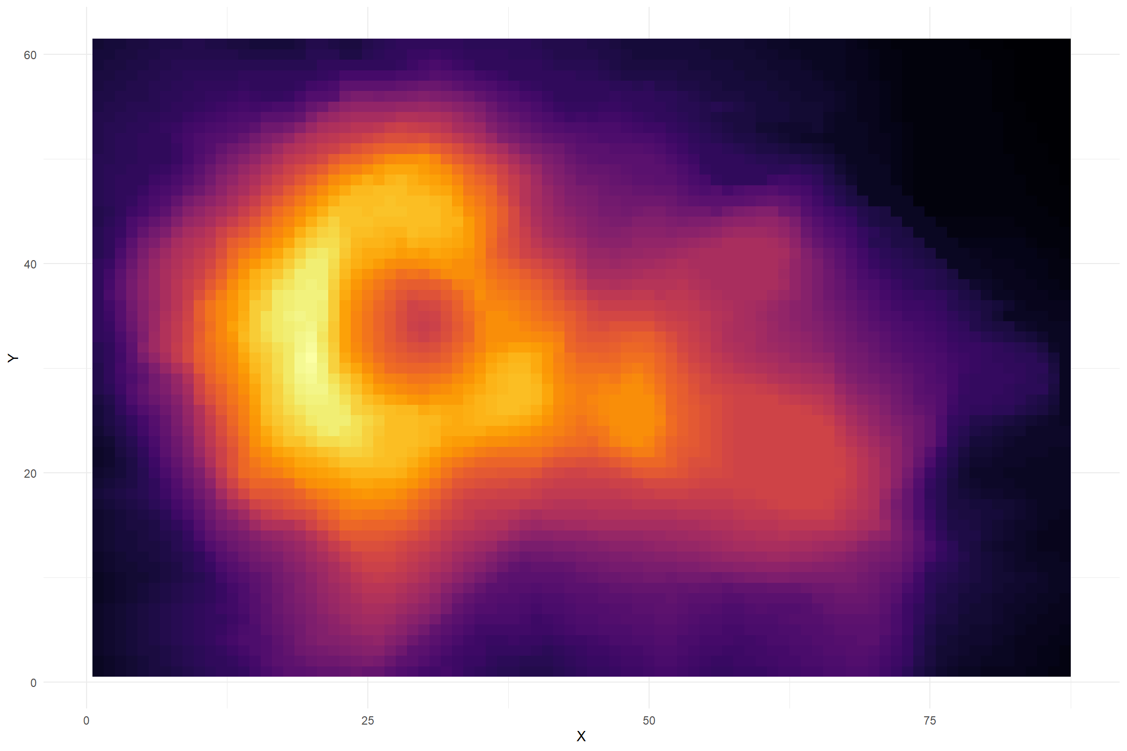
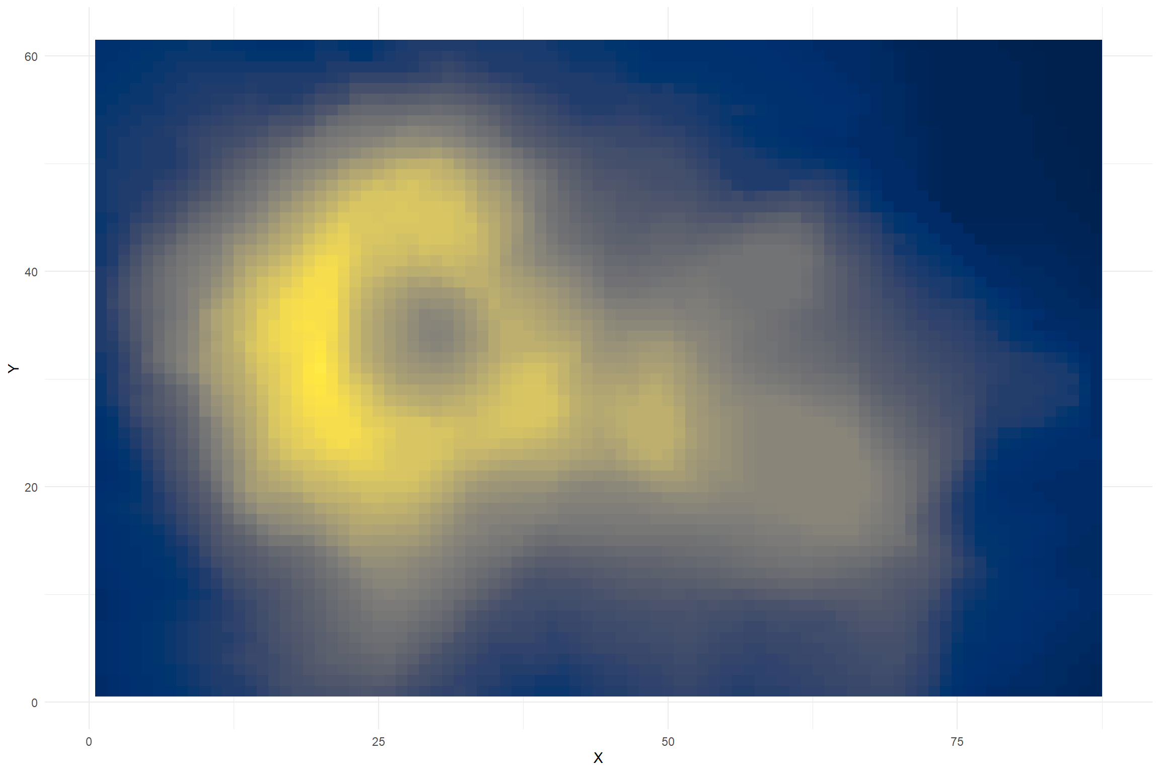
Color is often used to represent categorical data such as groups, countries, and regions. Color also can be effectively used to represent magnitude quite well. Eye-catching color is a good way to represent groups but requires some attention due to the prevalence of color-blindness and the ability of too many colors muddying the visual waters. Color is most effective when its use is limited and contrast is maximized to highlight the underlying message of the visualization.
Color to Highlight
In this plot, color is used to highlight a specific age range for individuals over age 65. This would be useful if you are interested in telling a story about elderly victims or were interested in exploring trends for this particular age group. It is much easier for the viewer to see your intentions when highlighting is used effectively versus expecting the viewer to visually separate the data points to find your message.
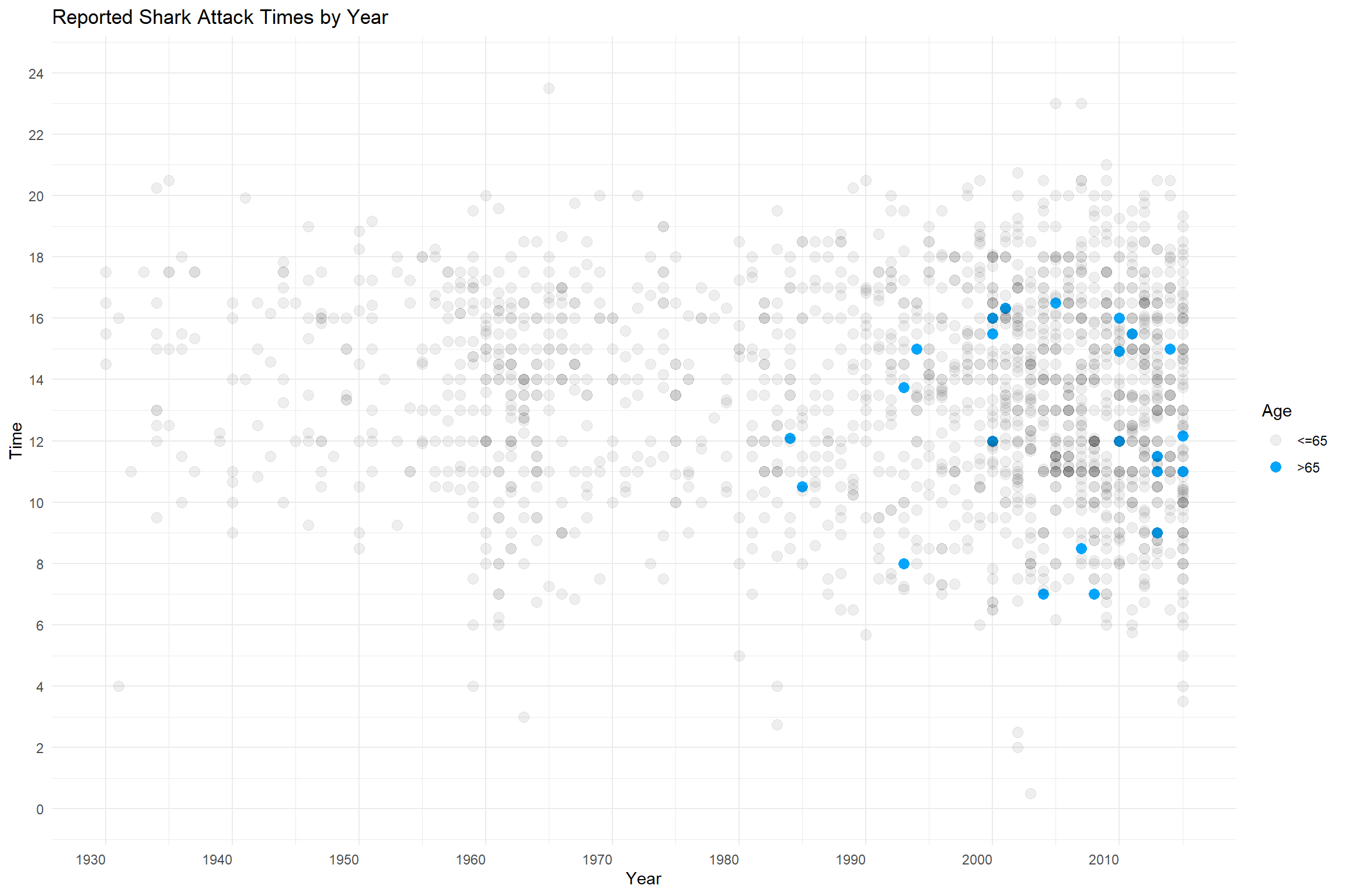
Pop-Quiz! Do you have any ideas why there are no reported attacks for the over-65 group before the mid-1980s?
Color for Magnitude
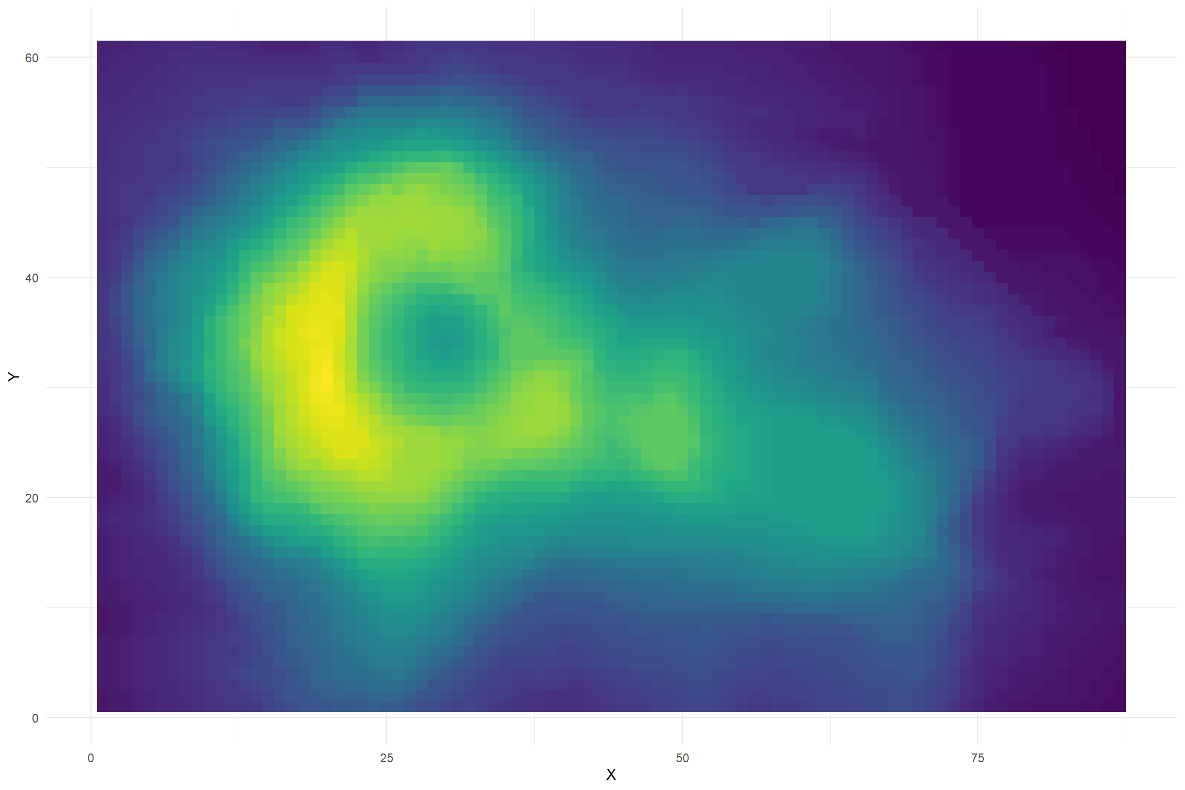
These data represent positional data and height for a volcano. From the dataset description: “Maunga Whau (Mt Eden) is one of about 50 volcanos in the Auckland volcanic field. This data set gives topographic information for Maunga Whau on a 10m by 10m grid.”
Hexadecimal Colors
Color is most easily represented as, well, a color. Because computers need to have instructions written as text, we must use other representations when programming.
In R code, you may see the color red (isn’t that a bit subjective?) written as ‘red’, ‘rgb(1,0,0)’, or ‘#FF0000’. You probably recognize that first one, but the other two use the red-green-blue and hexadecimal notation. These methods are usually interchangable without too much trouble, but I find the hexadecimal notation to be more broadly useful for web development and other needs.
What is hexadecimal notation and what does it have to do with color?
Very briefly, representing color as a hexadecimal form allows computers to store information more effectively. The values for each digit go from 0 to F, that is: 0-9 and then A,B,C,D,E,F. “FF” is equivalent to 255 and 1 in the other systems. So, FFFFFF is white and 000000 is black.
Web Tools for Color
You can search “color chooser” in the Google Browser to find this tool, but you can also select from many other online tools to find a hexadecimal code.
Fonts
Keep it simple. Remember your audience and the setting of your presentation. I like sans-serif fonts because they are cleaner. Prioritize legible text for whatever medium you are using. Presentation in a room? Make the text larger. Poster? Make the main text larger. Computer display? Smaller is usually okay as the audience will be ‘seated’ closely. If you are unsure, make the text a little larger than usual.
The Story
Start with a message in mind and edit to ensure you are delivering that message. Show your data visualization to a friend or two to hear their interpretation of your intended message. Use the title and caption to clarify if the message is a bit complicated (and there is nothing wrong with that). Simplify if you can: remove extraneous colors, backgrounds, decoration, line weight, and other distracting details. Move the legend into a position that doesn’t distract. Follow principles for accurate representation of the data.
Tufte’s Principles
A compact reading of Tufte in three points:
- Prioritize the data
- Maximize the data-ink ratio
- Eliminate chart junk
Real-world example!
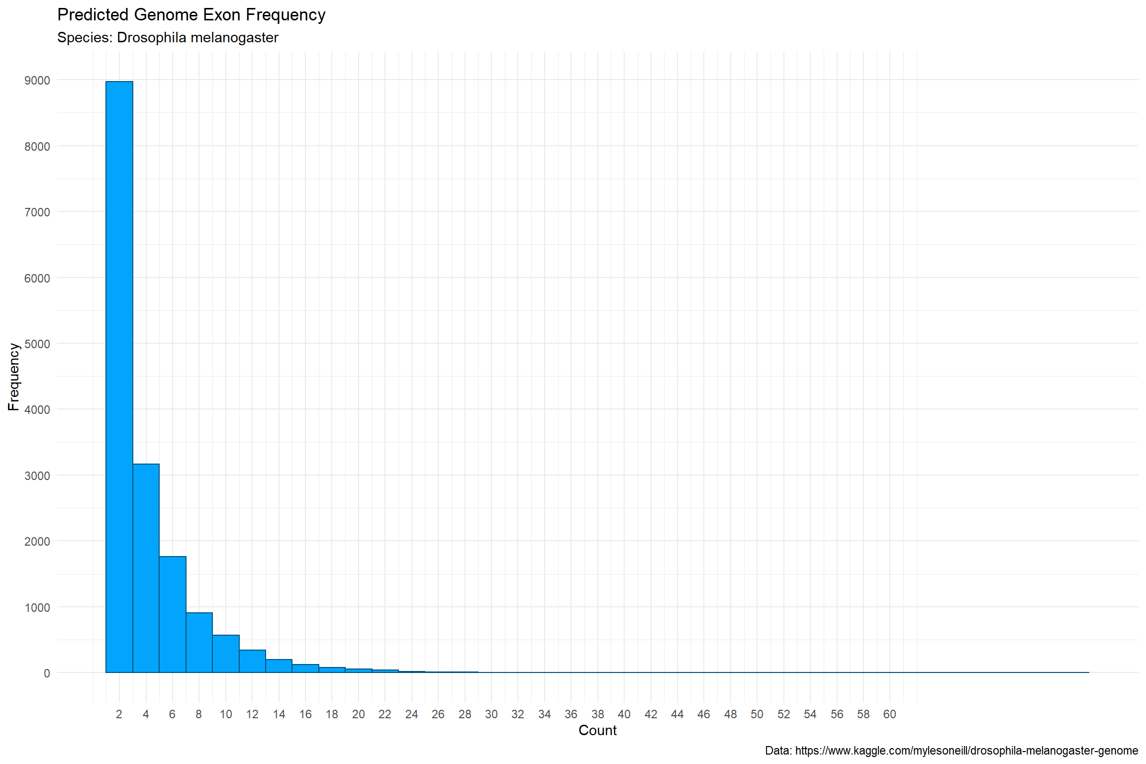
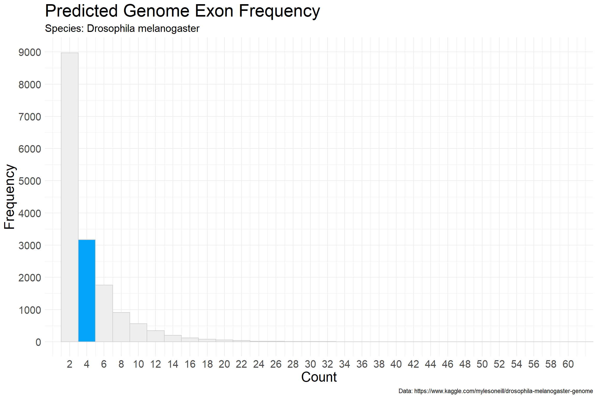
We have access to the fruit fly (Drosophila melanogaster) genome and we would like to determine, from a predicted gene dataset, the approximate frequency of genes that contain three to four exons (coding regions).
We will use a .csv file from the Drosophila data. These particular data were generated using AUGUSTUS software to predict genes from the genome sequence. Specifically, we will examine the ‘genes-genscan.csv’ file and observe the ‘exonCount’ column. Essentially, we will be plotting the exon count frequency for the fruit fly genome as predicted by AUGUSTUS.
To do this, we will use a histogram which groups count values into ranges such as 0-5, 6-10, etc. Histograms are not bar charts and typically display the bars together. The bars touch with no gaps in between representing a continuous series of values along the x axis.
Excel Histogram
Here’s a chart to start. This one (cropped) is the default histogram created in MS Excel and the only change was to the title.
What problems do you see with this chart?
What actions would you take to improve it?
R Histogram
Let’s make some changes! First let’s recreate the histogram with R and the ggplot2 library.
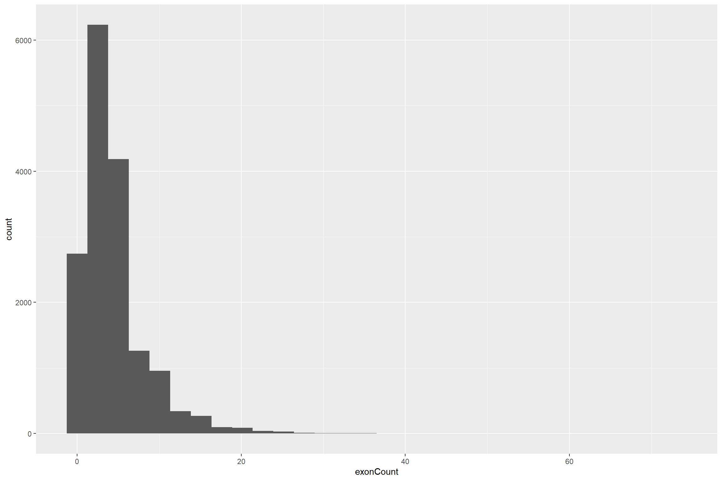
Let’s add labels and a caption for our data source.
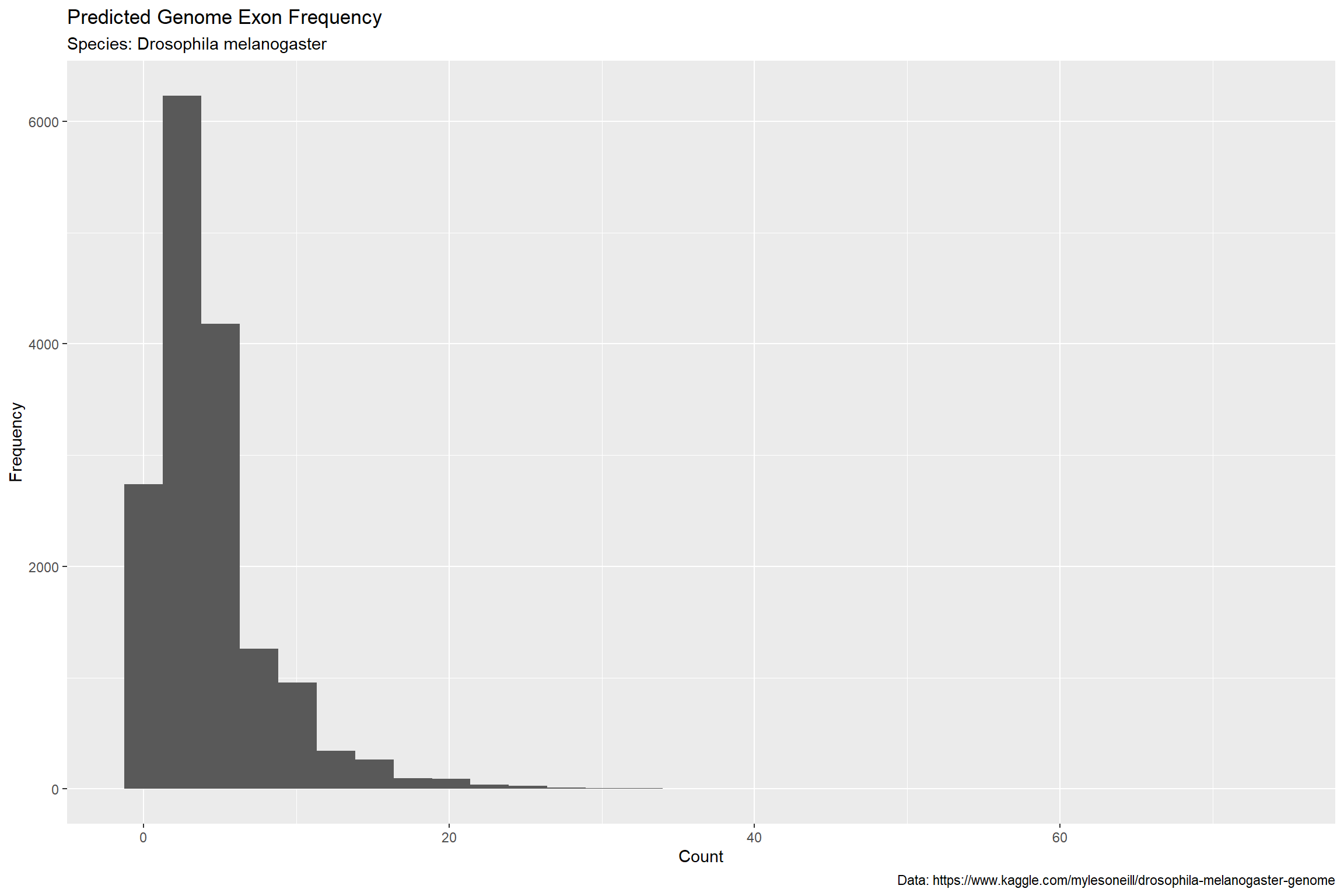
If you think the ‘bins’ on the x axis are not quite to your liking, you can adjust them easily with ‘binwidth’. We’ll set the binwidth to 2.
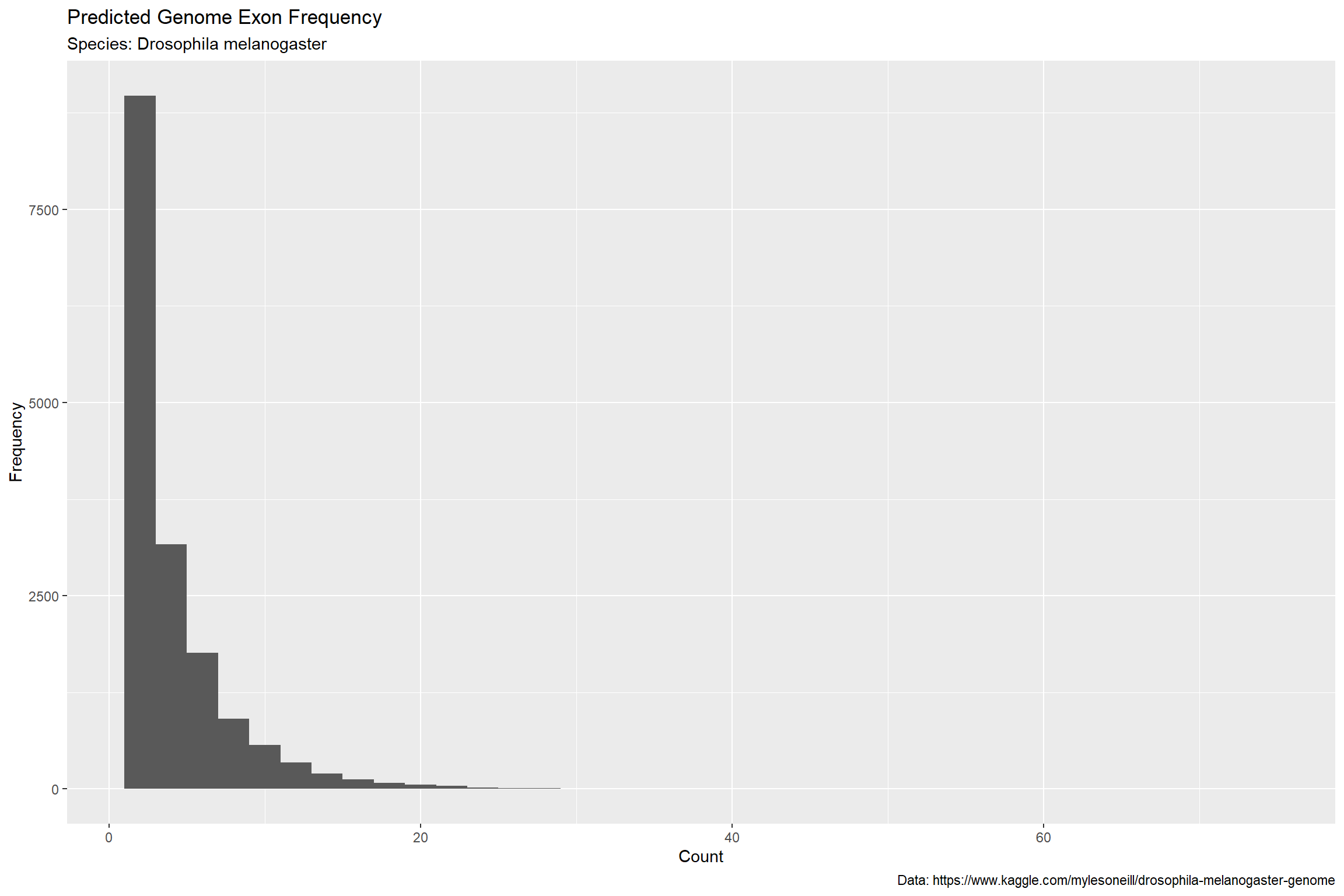
Let’s adjust the scales on the axes. This way we can see values more clearly and adjust the spacing to our preferred setting.

We can make this look a lot better by diminishing the background and adding a pop of color.
We can add a highlight to call attention to the frequency in the second bar (assuming this is important to the story). We can also increase font size and tweak the axes just a bit to limit the size of the unused white space.
Further Reading
Additional information is available in the works of many authors who focus on the field of information design, but you may do well to begin with an exploration of the following:
- Jacques Bertin
- Semiologie Graphique (Semiology of Graphics)
- Edward Tufte
- Visual Display of Quantitative Information
- Envisioning Information
- Visual Explanations
- Beautiful Evidence
- Scott McCloud
- Understanding Comics: The Invisible Art
- not info viz specifically!
Open Data
Scientists often create data but you may be interested in creating practice visualizations using data made available online from a variety of contributors. You can find a wealth of data resources published by government entities such as the US Census Bureau but also through sites such as Kaggle.com.